Your Safety: Lifeguard and a new digital assistant
Mobile application that help Ukrainian activists to share their data and location for getting quick help from trusted contacts.

Idea
Unfortunately, no one is insured against health emergencies. Living in the technological world, you need to adjust your life to all available tools that will help you cope faster and more effectively with emergencies. This is how idea arose to create an application that will call for help in the first seconds of trouble.
Task
We analyzed what is most important in emergencies - the use of phone sensors for continuous recording of video, audio and location data. Along with this data, the device must send text messages to all trusted contacts. This will allow them to understand what is happening and respond accordingly.
Solution
We researched similar applications on the market and interviewed people directly involved in the industry (police and ambulance dispatchers). From the data obtained, we were able to build ways to solve these problems.
Technologies
The process of creating the program "Your Safety" was divided into several stages - the development of the database and the creation of interfaces. We've also developed features like a friend's phone message or location base.
Scope of work
Data collection
UX Research
Design Phase
User Testing
Related services

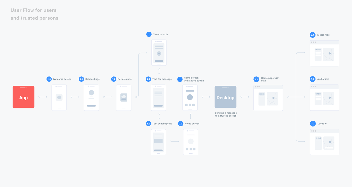
User flow
The path should be simple so that app users can reach trusted people effortlessly.
Regardless of whether he is calling for help or taking pictures, the user should move around the screen with minimal "click".
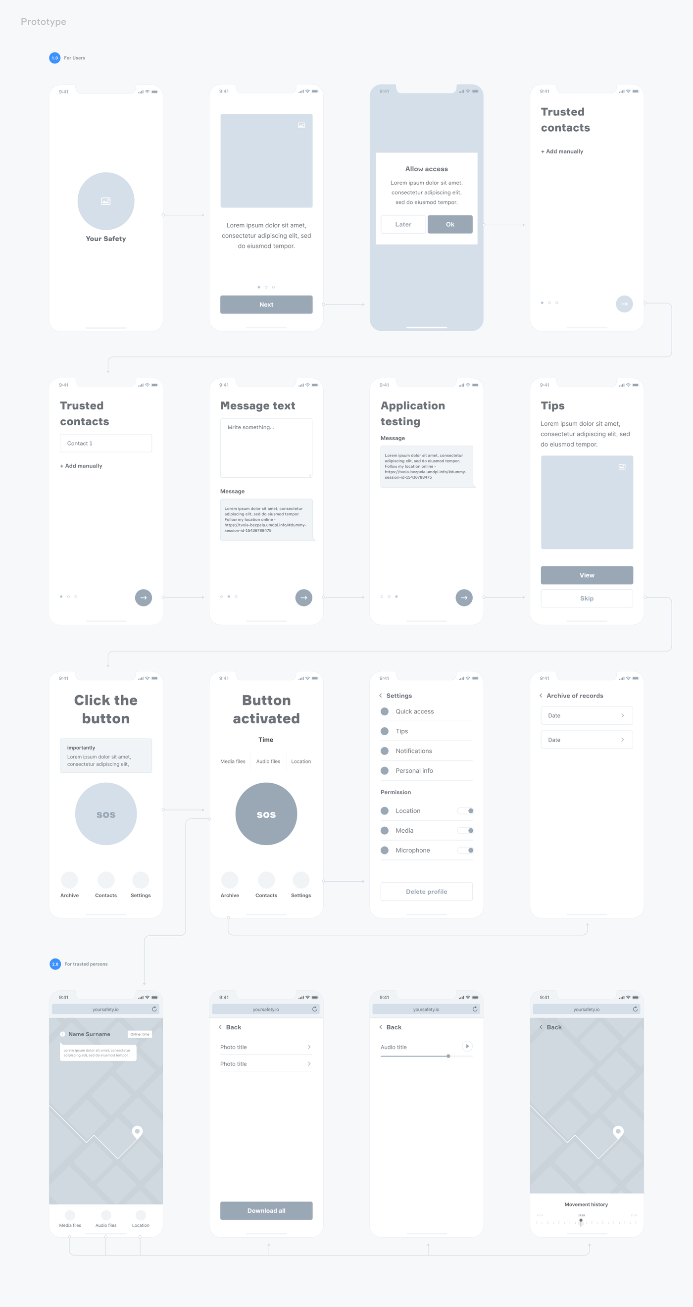
Prototype
The next step was to test the interactive prototypes within the team and on potential users. Gathering all the feedback, we were able to improve our prototype to build a full and effective system of user interaction with the application.
Design
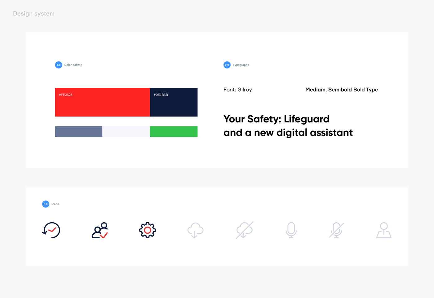
We started the design with an associative series, which includes all the items that come to mind when calling for help. It is the red button that inspired us to create the design.
After that, we moved on to the harmonization of the main colors, namely: bright red, as the main and white additional, which serves as a balance for other colors and has a calming effect on the user. We decided to use the grotesque Gilroy font, which consists of rounded non-aggressive letters.
Design elements
Every detail of our design had to be informative. Therefore, all icons and other design elements are reproduced for one purpose: to provide assistance to the user.
Onboarding
When the application is loaded, the entry screens endear users. They begin to realize that they are not alone.
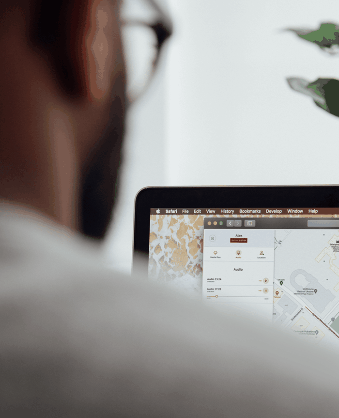
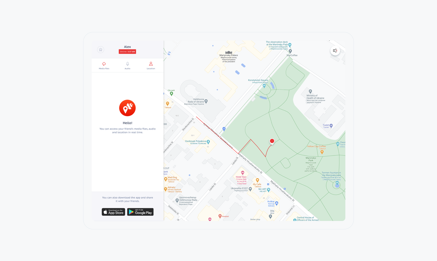
All data is sent to the trusted person`s phone. It can open them on a mobile device or on any computer.
The tracking interface informs the trustee of his whereabouts so that he understands where to go or where to call an ambulance / police. The geolocation is presented on a readable map.
Activia
Request a quote.
Thanks for scrolling this far. Let's take the next step. Provide us with a brief description of what you are going to build.