BeProfi
BeProfi is a bespoke e-learning platform tailored for a diverse array of professionals. From social workers to psychologists, volunteers to government and non-governmental organization leaders, BeProfi offers comprehensive courses crafted to elevate their expertise and impact.

About the project
BeProfi provides online courses for the professional development of social sector workers. The platform features courses from experienced curators with deep expertise that allow you to acquire and develop competencies to apply them in practice.
Business objectives
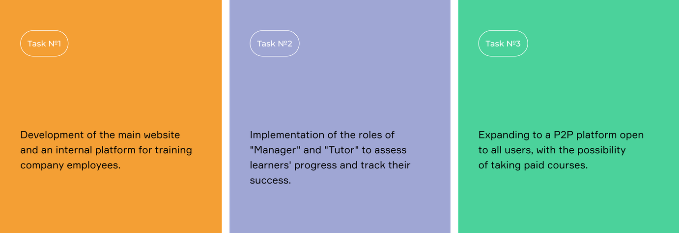
The initial phase involved developing a training platform tailored for company employees eager to enhance their skills, with plans for transitioning to paid courses to compete with other online platforms.
Role Hierarchy
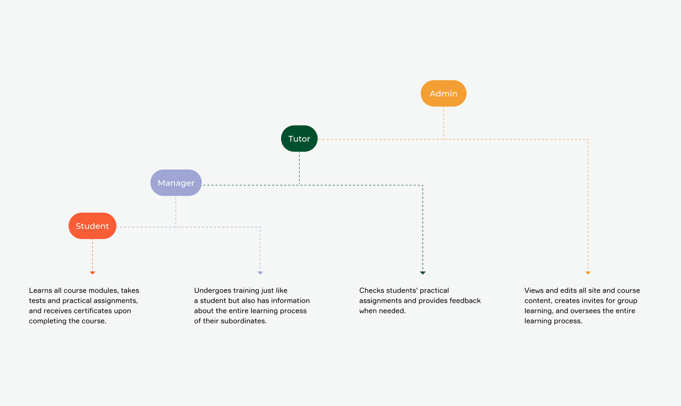
The platform consists of four roles: student, manager, tutor, and admin. The complexity lies in the hierarchical structure: the admin has rights over all roles, the manager has student rights, and only the tutor can assess student assignments without interfering with the learning process.
Scope of work
Discovery & Strategy
UX Research
Design Phase
Development

Related services
Technologies
Integrations
User Journey
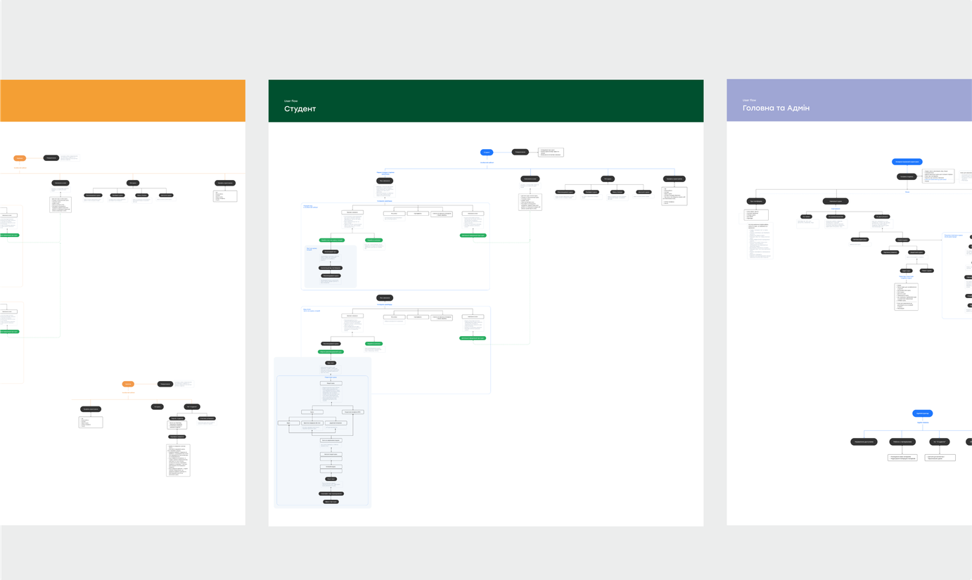
Having established a comprehensive history of roles and functions, we were able to meticulously craft the user journey for each role, drawing upon analysis of similar platforms. Utilizing this data, we seamlessly developed a website prototype.
UI design
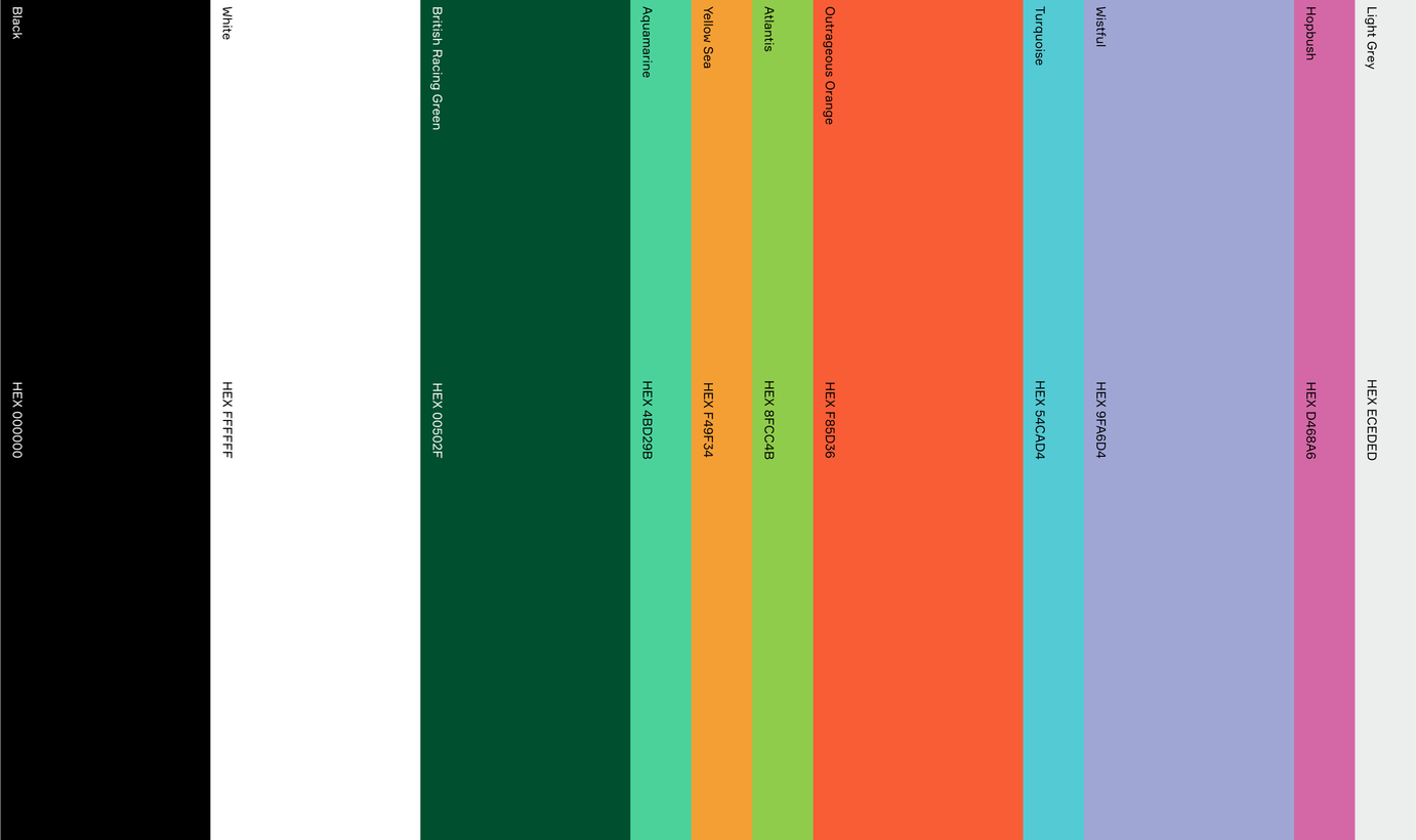
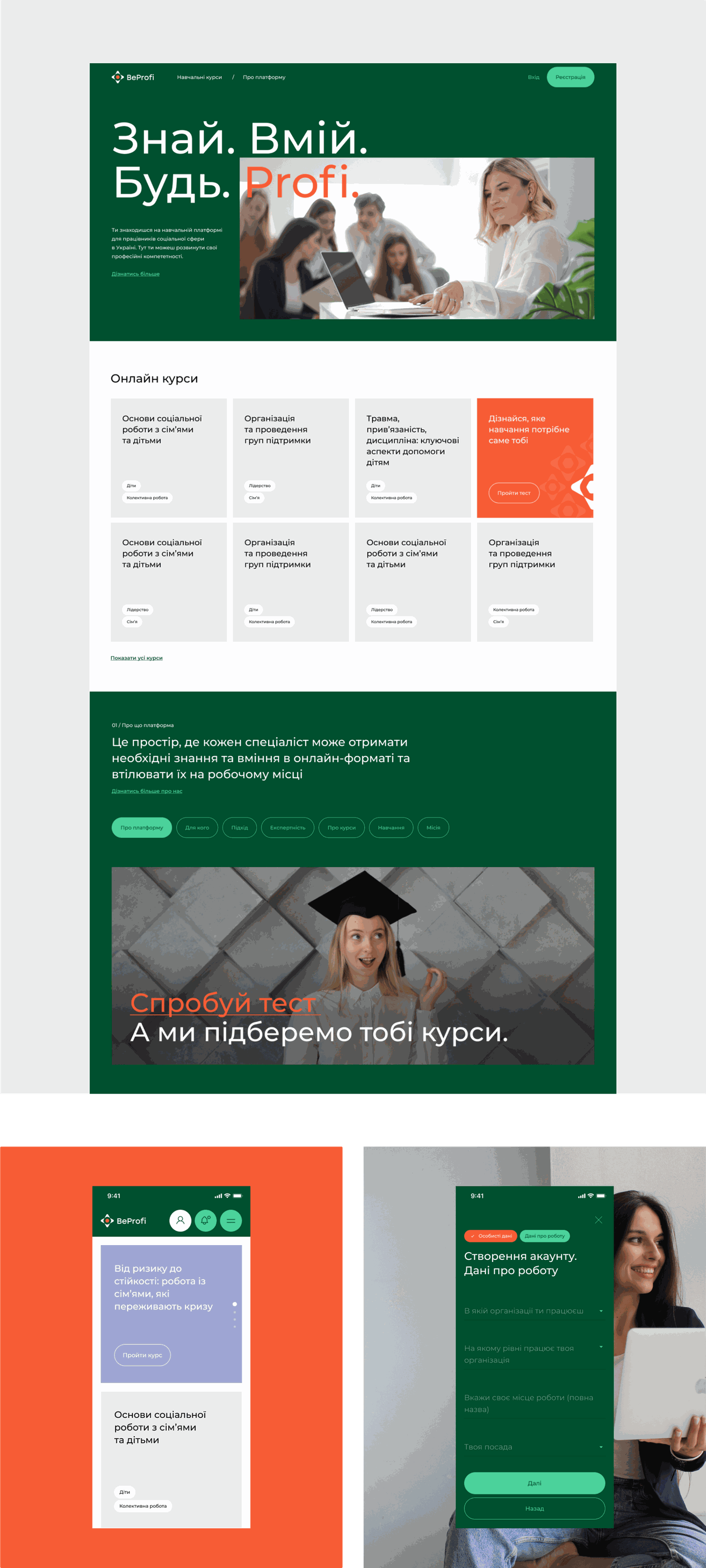
The platform now boasts a fresh visual identity that reflects the bold and rapidly evolving nature of the organization. We've employed a monochromatic base palette complemented by vibrant and diverse colors. Each color corresponds to a specific course system. Consequently, as users navigate through multiple courses simultaneously, they visually associate colors with the course themes.
Main website
We aimed to create a website that is both simple and modern, utilizing bright colors without overwhelming it.
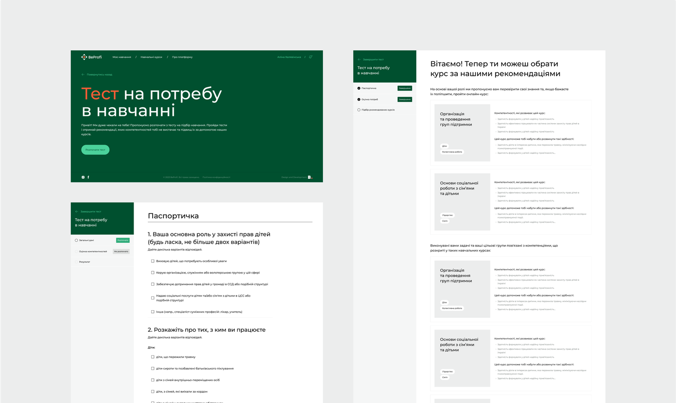
Personalized course recommendations
To make it easier for users to choose courses, we've implemented a survey feature that takes into account each individual's skills and needs. After completing the assessment, users receive a personalized list of recommended courses tailored to their goals and proficiency level.
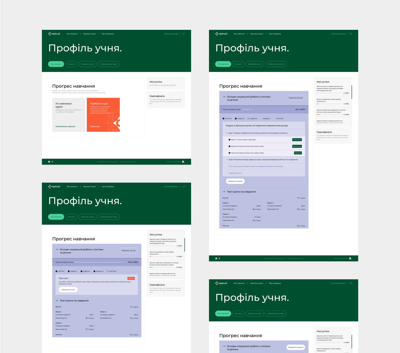
Student dashboard
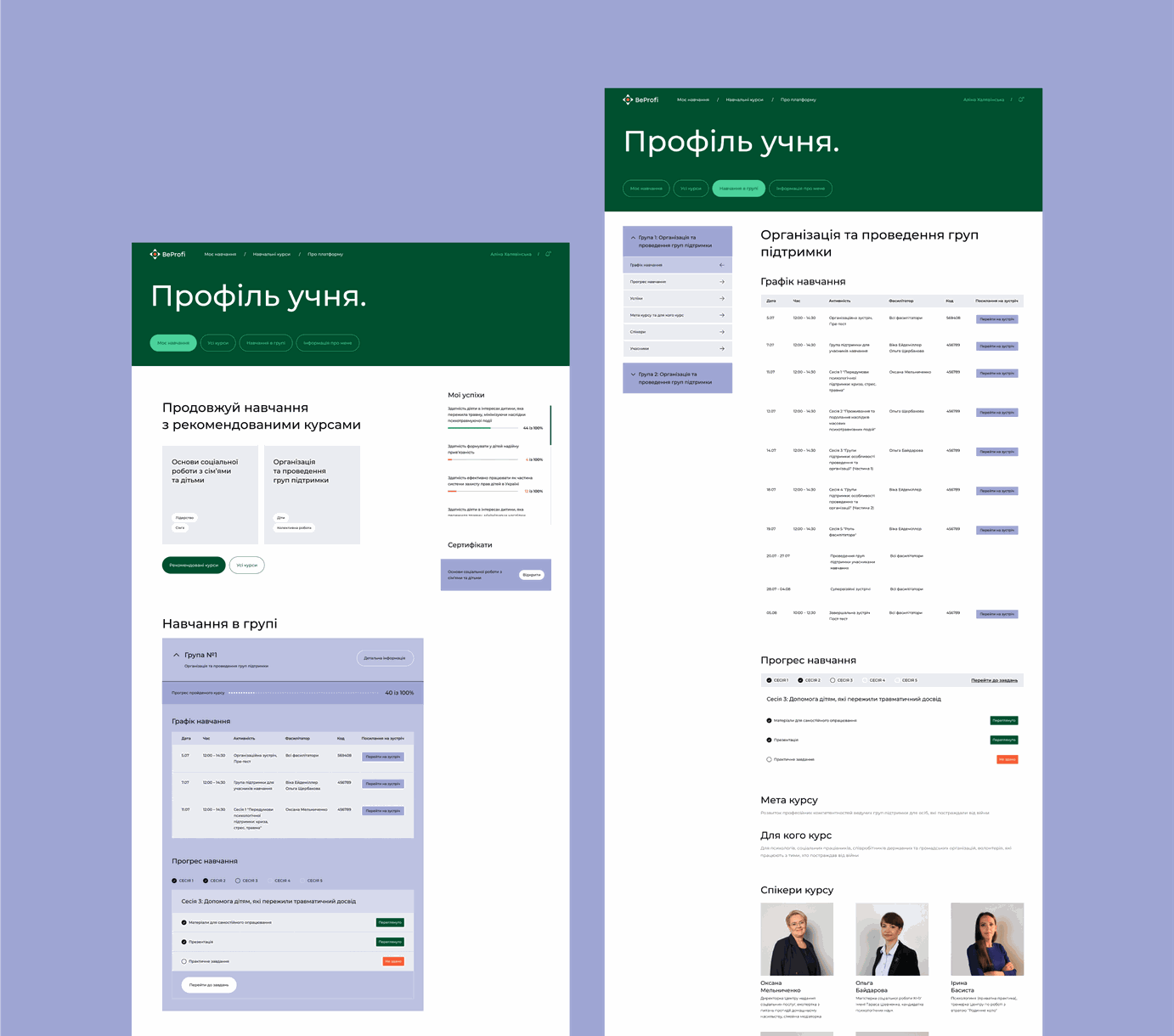
Each student and manager has their dashboard. Depending on the stage the user is at, the dashboard reflects different information. Initially, courses are selected based on the user's competencies identified after taking a test. Then, the user sees the progress of the course. Upon completion of the course, the dashboard displays a certificate, as well as the percentage of competencies gained across all completed courses.
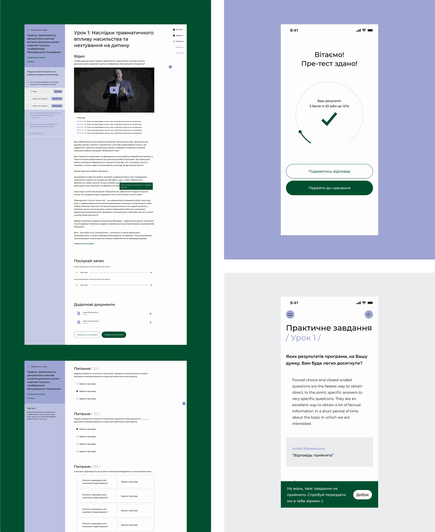
Course progress
Each course is divided into modules, and each module consists of lessons with tests and practical assignments. A distinctive feature of the courses is that they can either have practical assignments with or without mandatory assessment. If there is no mandatory assessment, the next lessons in the module open automatically. However, if there is an assessment, the lesson cannot be accessed until the curator checks the practical assignment and grants access to the next lesson.
Group learning
We've also introduced a group learning option that allows multiple users to take a course together. Enrollment in these group courses is by invitation only and materials are released to participants according to a schedule set by the administrators. This format consists of learning sessions and their associated activities, without a modular lesson structure. Successful completion of the course is determined by submitting all practical assignments.
Manager's platform
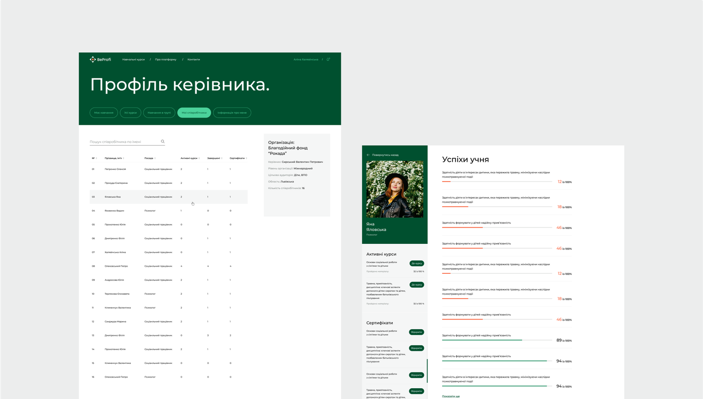
The special feature of the manager’s platform is the ability to monitor the learning process of their subordinates. This is done so that the manager understands how much progress an employee is making, what their strengths are, and whether there is a need to enhance other competencies.
Tutor's platform
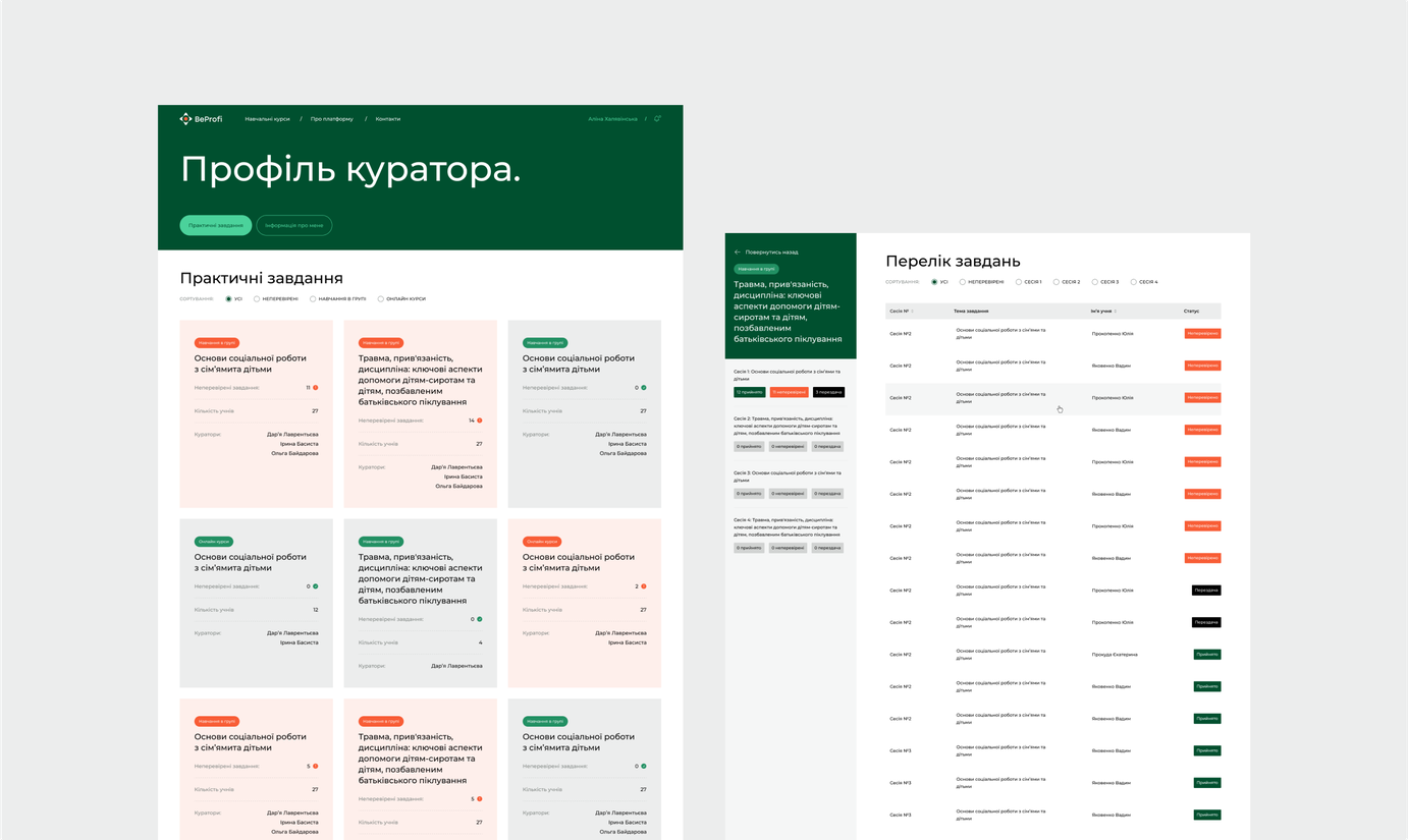
The main task of the tutor is to receive and review practical assignments from students. In case of incorrect execution of the assignment, the curator sends it back for revision. We have added the ability to comment on received practical assignments so that the student can immediately understand what was done incorrectly and why.
Result
Our collaboration with BeProfi has transformed social online learning. The revamped platform seamlessly combines an internal training environment with a user-friendly, peer-to-peer marketplace accessible to social sector professionals.
Implementing "Leader" and "Tutor" roles enables comprehensive learner assessment and progress tracking. The vibrant, color-coded visual identity enhances user experience across multiple courses. Scalability ensures the platform can accommodate businesses of all sizes.
The platform is now in its beta phase that allows BeProfi to test and refine their marketing offerings while tapping into the revenue potential of the online education market.
Thanks to BeProfi for leading the e-learning landscape
Request a quote.
Thanks for scrolling this far. Let's take the next step. Provide us with a brief description of what you are going to build.