EASY PEASY Insurtech app redesign
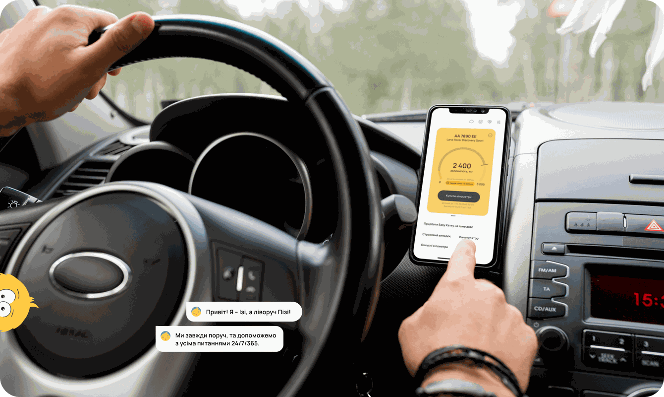
EASY PEASY is an insurtech mobile application allowing to pay for CASCO as you go. Users can make insurance payments not for the entire insurance year but in small parts, which are expended precisely during the usage of the insured car.
Product
EASY PEASY is the first Ukrainian insurtech startup, making car insurance convenient and cost-effective.
The tech company EASY PEASY Insurtech has launched an online neo-insurance service for purchasing car insurance based on the "pay-as-you-go" principle or payment per kilometer to the Ukrainian market. To insure a car with CASCO, no need to visit an insurance company and pay for an entire year upfront. You can buy insurance that includes 500 CASCO kilometers from the mobile app.
Work stages
Beginning or Release 1
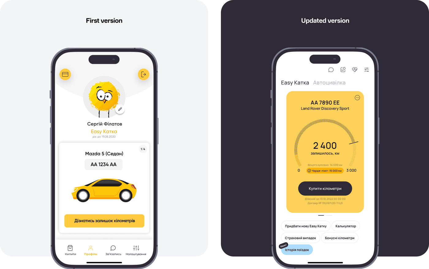
In early 2020, we received a request to redesign an existing app. The current version needed more visual hierarchy, simplicity in design, navigation, and user-friendliness. The product team received frequent negative user feedback about the interface.
Present or Release 2
By the end of 2021, we get back to the application with significant changes planned for the future product. More than a single button was needed for scaling plans. So, our task became the development of a full-fledged app with features for not just buying additional CASCO kilometers based on the contract issues via the website but also purchasing new policies via the app, even while sitting in a car. Existing users must be able to update their policies, and new ones can purchase motor liability insurance along with CASCO.
Our solution
Research
Understand
Design
Develop
Technologies
Integrations
Related services
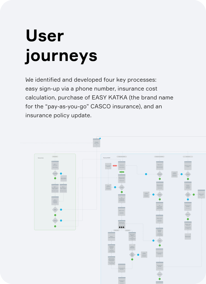
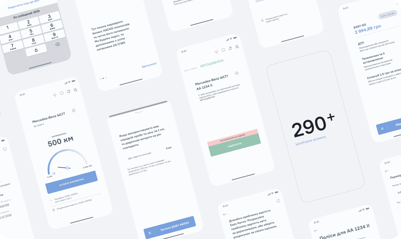
UX design
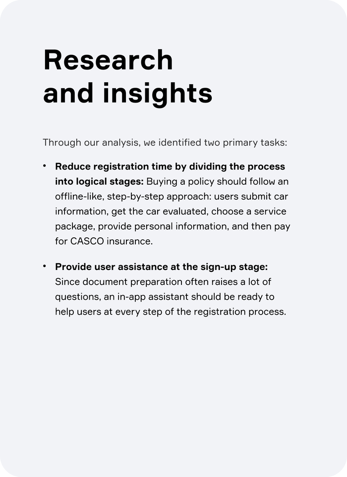
We crafted wireframes based on analytical data gathered during the research. The prototype aided in summarizing the project's structure and the critical nuances vital during the mobile app's development.
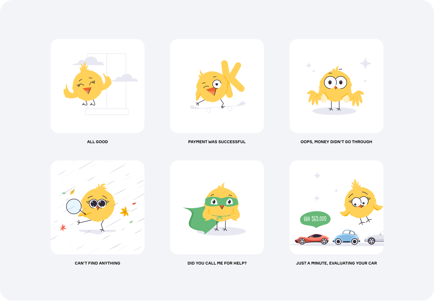
Illustrations
The mascots of the app are the birds, Easy & Peasy. For the first release, we brought them to life, infusing them with emotions. After expanding the application to over 300 pages, we continued the app's graphical narrative and introduced a broader color palette.
UI design
The major challenge was crafting a scalable design system so that new features would seamlessly blend with the app's existing design in the future.
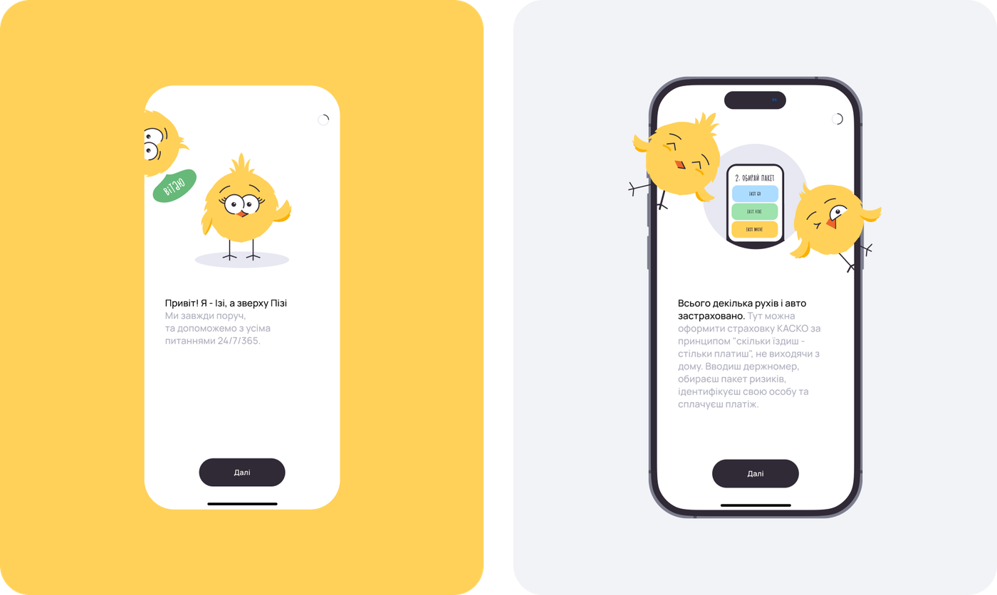
Onboardings
We refined the onboarding process from the first version. Through animated birds and compelling copy, we breathed life into the app, transforming it into a genuine companion for the user.
Main Page
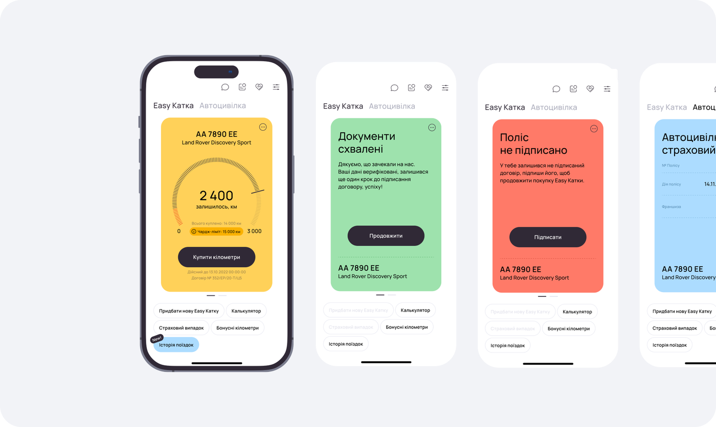
The "screen within a screen" approach helps keep the user's attention on the essential status of their policy's registration, payment, and kilometer top-ups.
EASY KATKA Purchasing
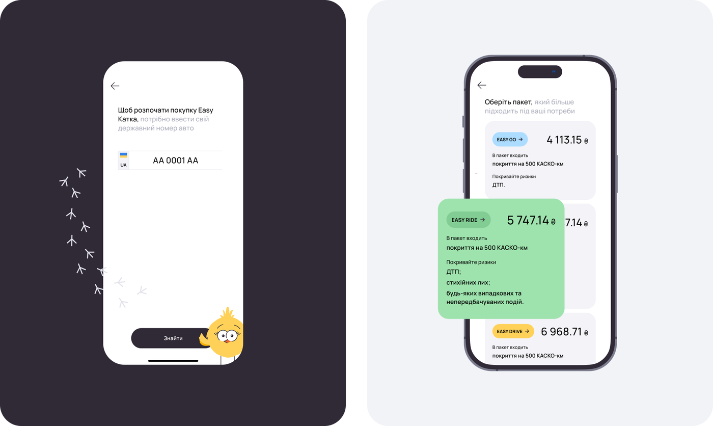
One of the most critical phases is the purchase of EASY KATKA. This feature guides users through a logical series of simple steps: entering the car number, confirming the vehicle's valuation, selecting a service package, authorization through BankID, signing the agreement, and finally, paying via IPay.
Other screens
Development
Our team focused on front-end development. The policy issuance process was the most challenging due to its multi-layered logic and plenty of user scenarios.
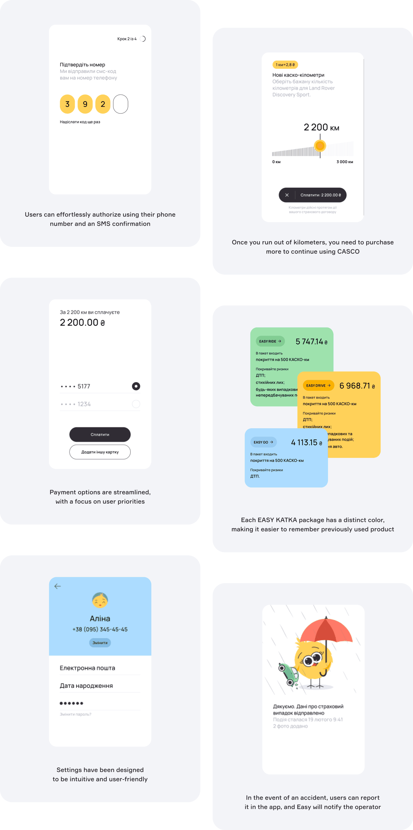
There were no ready-made libraries available, leading us to develop custom solutions. Users can swiftly authenticate via the BankID integration and quickly locate an address through manual input, thanks to the integration with Nova Poshta. A progress bar embedded within the contract card helps users keep track of their kilometer usage.
Using Firebase dynamic links, we quickly ensured smooth data transfer from the website's calculator to the app. However, iPay payment service integration for handling policy payments presented another challenge. Since different contracts have their specific payment logic, we configured the payment status processing, search for active payments, and re-payment process initialization tailored to each type of contract.
Product website
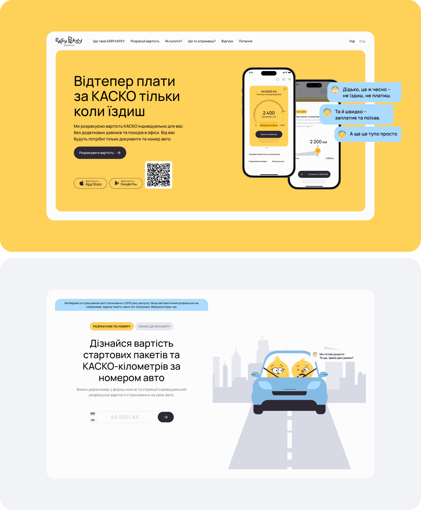
We also created a marketing initiatives tool: a vibrant single-page website with essential app information. Using this site, users can calculate the cost of EASY KATKA, which is then transferred to the application. After downloading the app, users can immediately proceed to policy issuance.
Support
Even after the development, we continue to provide technical support to users, monitor, and enhance the app's performance. We're also mapping out the introduction of new features, aligning with extensive product plans. So, stay tuned for more case studies :)
Thanks to EASY PEASY for creating together
Munchy
Request a quote.
Thanks for scrolling this far. Let's take the next step. Provide us with a brief description of what you are going to build.