Looker Studio Setup for an IT Company
Our client's sales and marketing teams used to spend 2–3 days preparing reports: exporting data from five platforms, merging spreadsheets, building decks. The company needed faster, more precise decision-making. So, we built them a unified Looker Studio dashboard consolidating HubSpot, GA4, Search Console, Google Ads, and finance data with 80% automation. Now the team opens the dashboard in meetings, applies filters, and makes decisions on the spot.
Why our client needed a unified analytics system
Being a custom software development agency, our client works with international clients, generating leads through SEO, PPC, paid directories, and outbound outreach. Knowing where to invest and which markets are worth pursuing requires reliable performance data. The thing is, having data and having clarity are two very different things.
Analytics reality before Looker Studio
The data existed, but consolidating it was time-consuming. Marketing reporting relied on manual exports from each platform, then merging everything into spreadsheets before converting to presentation decks. All this created practical challenges familiar to growing service companies:
Reviews started 2–3 days late while the team manually merged data from five tools
Spreadsheet errors occasionally required recalculating entire reports
Marketing and sales referenced different sources for the same metrics
Questions during meetings couldn't be answered in real time since the team had to go back to Excel
Comparing trends across quarters meant building new reports from scratch each time
What set out to build
After going over the challenges with the client, the goal was clear to us: replace static reporting with a real-time decision-making system. It had to be one dashboard that marketing, sales, and leadership could all use at once — pulling live data from HubSpot, GA4, Search Console, and the finance system, without manual consolidation.
Expected outcomes:
Real-time visibility instead of delayed Excel reports
One shared source of truth instead of separate interpretations of the same data
The ability to instantly compare channels, regions, and services and reallocate budget at the beginning of each cycle based on what's actually working
Discovery: Prioritizing the decisions needed
We didn't want to build a dashboard full of charts nobody would use. So we started with requirement mapping sessions with the client’s department heads. Each lead identified what they actually needed to make decisions and marked every potential chart with clear priorities: “Must have,” “Nice to have,” “Not relevant.” That alone cut out a lot of noise.
Once our data analyst built the first MVP widgets, we reviewed them together with the client’s team and adjusted as we went. Turns out, the order of metrics that looked good in a requirements doc didn't always make sense once we saw it visually. We reorganized everything to match how decisions actually get made in meetings.
A few insights that changed how we approached the build:
Performance by segment became visible for the first time. Instead of assumptions like“ should perform better,” the client had actual SQL and conversion dynamics per segment on one screen.
Their seasonality didn't match industry benchmarks. Industry data says autumn is the strongest period for custom software leads. The company’s data said spring. That flipped their planning logic completely.
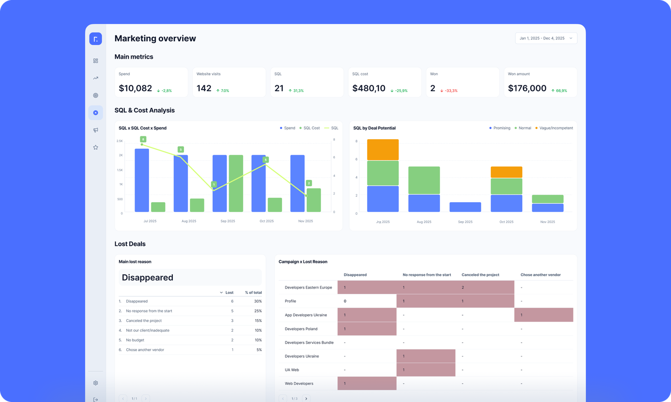
CPL alone doesn't tell the full story. The client stopped making decisions based on cost per lead alone. Now they see how many SQLs actually move to Proposal and Won stages, and what the average deal value looks like per channel. Efficiency is evaluated by real pipeline impact.
Historical comparison became effortless. Looker Studio's year-over-year and month-over-month switching is built in. Now the client can tell whether a performance shift is market seasonality or something they're doing differently.
Designing for intuitive use
We wanted anyone on the client’s team to open the dashboard and understand it immediately — even people who hadn't been part of building it. The design is clean and minimal: no clutter, clear grouping, and instant clarity on where key metrics are.
The dashboard is structured into three high-level views: Overall performance → Sales-focused insights → Marketing performance. Inside each view, charts are ordered by real decision-making logic, not by data source. It feels more like a control panel than a pile of disconnected analytics.
Navigation and UX principles applied:
The “open and understand immediately” rule. Every chart is labeled with business language, not technical jargon.
Intentionally limited filters. Filters are restricted to time periods only, with other dimensions available directly inside each chart through sorting and interactive selection. This prevents filter overload and keeps navigation clean.
Zero onboarding time. Any stakeholder should be able to enter, see the state of performance, and take action without assistance from an analyst.
Each visualization is documented internally, so every team member can see not just which data source powers it, but how the metric is calculated and what is being displayed. Users from different departments don't always know all the metrics from both sides, so comprehensive documentation ensures everyone can work confidently with the data.”
The solution: One system, three perspectives
We built the Looker Studio setup around three user groups: marketing, sales, and C-level. The dashboard views are tailored to what each team actually needs to make decisions.
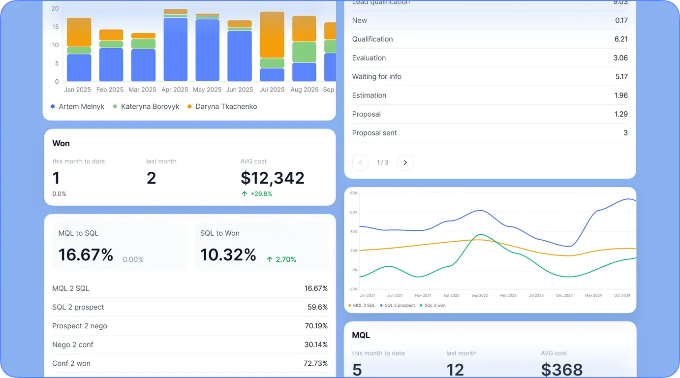
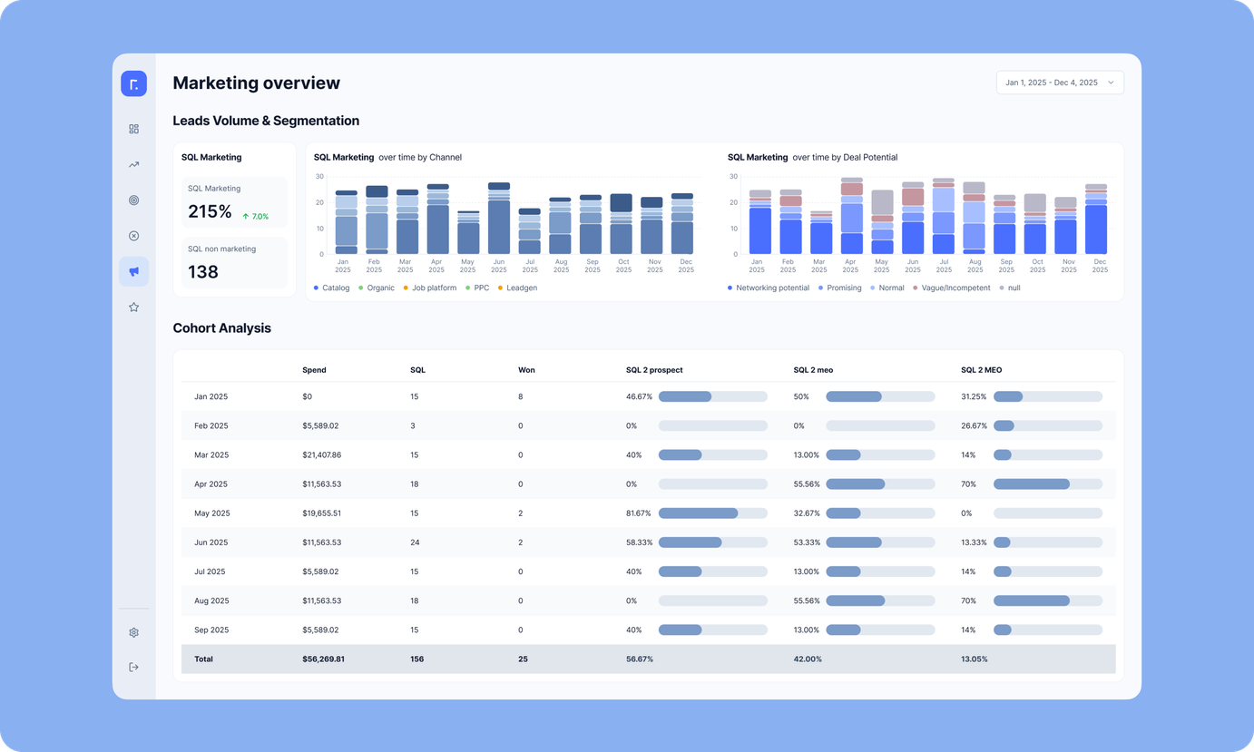
Marketing dashboard
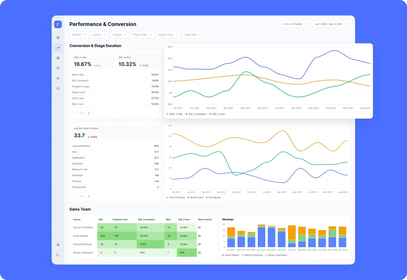
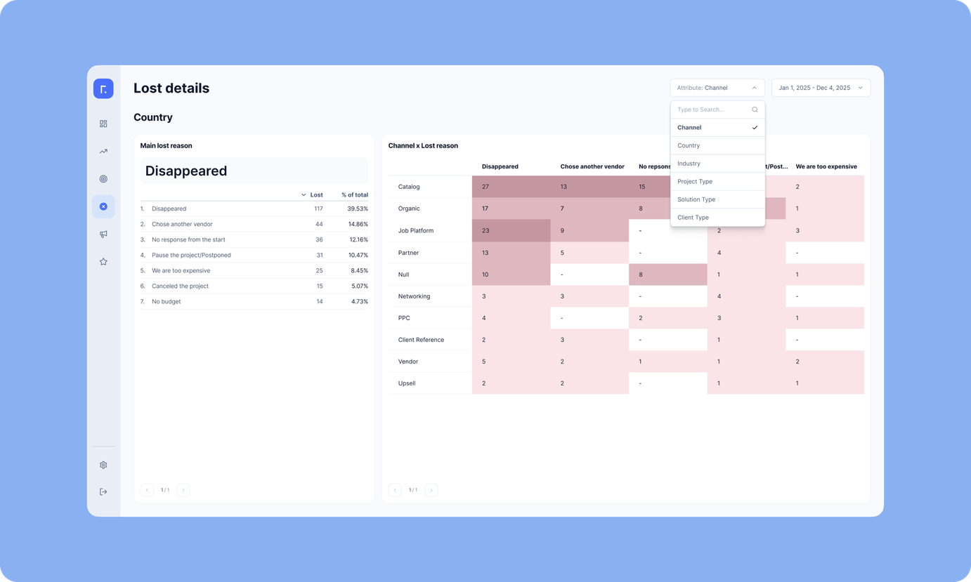
The marketing team uses this view to evaluate channel performance: SQL volume, cost per lead, and conversion rates from SQL through to Won. They can filter by country and service line to see which segments consistently outperform. At the start of each quarter, this dashboard drives budget decisions. The team puts more money into channels with strong live performance instead of relying on retrospective reports.
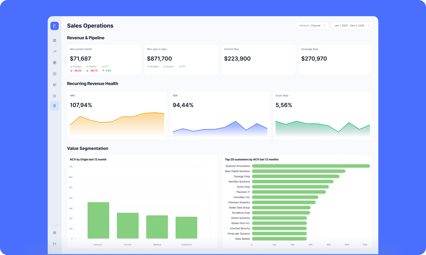
Sales dashboard
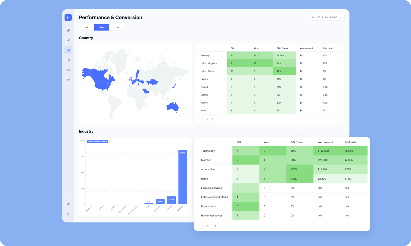
Sales leadership tracks pipeline health here, monitoring how deals move from SQL to Proposal to Won. The dashboard shows conversion rates at each stage, average deal values, and velocity metrics broken down by service and region. It helps leadership balance workload and spot bottlenecks where deals are stalling or where the team needs support.
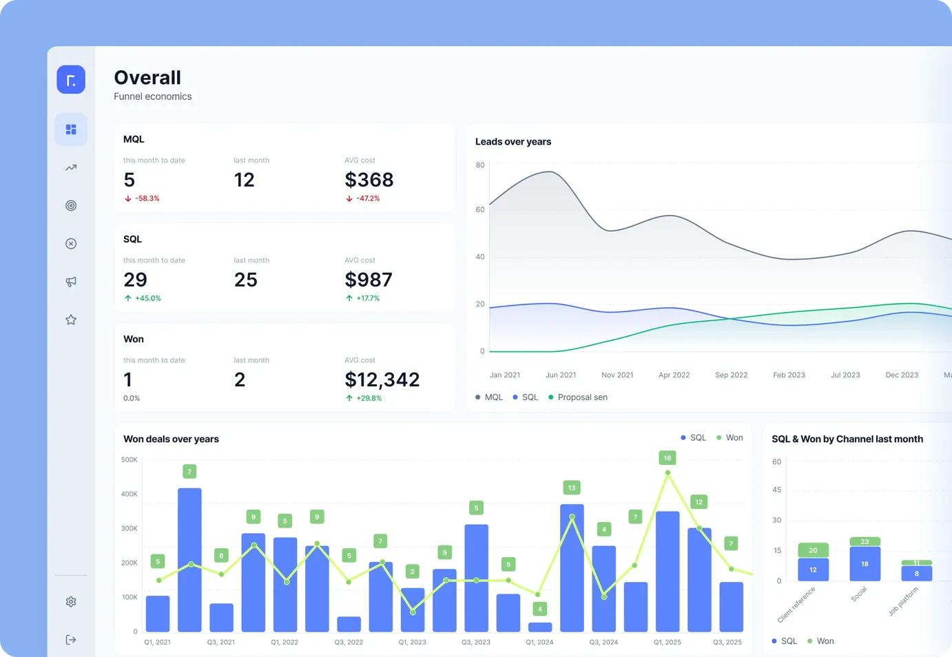
C-level view
Leadership sees the full business picture: marketing spend flowing into MQL and SQL generation, then converting into revenue. The dashboard connects every dollar invested to pipeline outcomes, showing ROMI by channel, region, and service line. C-level can quickly compare performance across quarters and spot high-level trends like seasonal patterns or shifts in average deal size
Data connections established
We integrated five primary data sources using a hybrid architecture that combines direct Looker Studio connections and database-mediated flows.
Direct Looker Studio connections:
GA4: Traffic quality, top channels, engagement behavior
Search Console: SEO trends and regional visibility
Google Ads: Paid channel performance mapped alongside organic and referral channels
Database-mediated connections via PostgreSQL:
HubSpot: Comprehensive deal data, including SQL stages, lead source attribution, UTM-based identification of channels like Clutch, Sortlist, and Upwork. HHubSpot data is pulled via API into the database and then into Looker Studio via the native PostgreSQL connector plus SQL scripts
Finance tracking system: Channel-level spend synced for CPL and budget versus SQL/MQL analysis
Approximately 80% of data sources are now fully automated. Finance still requires manual input at first, but once it's entered, everything flows into the dashboard automatically.
Technical architecture and automation
Hybrid data refresh system
Together with the client, we decided to use a mixed refresh approach. Looker Studio's cache keeps data fresh for a set number of hours, depending on the source. When someone opens the dashboard, new data loads automatically if the cache has expired. For HubSpot and finance data in the database, we added extra update mechanisms. Finance updates on a timer. HubSpot refreshes every time specific deal fields change, so critical metrics update near-live.
Calculation logic distributed for optimal performance
Most metrics are calculated directly in Looker Studio. But some complex calculations (especially financial ones) run in SQL scripts within the database. This ensures we correctly map data from different sources at varying levels of detail and don't miss anything when calculating CPL. The SQL layer also restructures HubSpot's format, sometimes turning a single deal line into 13 separate rows to work around Looker Studio's graphing limitations and make stage-based calculations more flexible. Year-over-year and month-over-month comparisons use Looker's built-in tools.
Key capabilities delivered
Centralized performance visibility
All marketing and sales data lives in one place now. No one switches between tools to find numbers or spends time reconciling conflicting reports. The team works from a single source of truth, which means fewer debates and more time spent on strategizing.
Full pipeline transparency
The dashboard shows how SQLs and MQLs move through each stage of the funnel. Sales can track deal velocity and see how workload is distributed across the team. Marketing gets visibility into lead quality based on how far those leads actually progress through the sales process.
Comparative insights by segment
The client can instantly see which services perform best in which regions. Year-over-year and month-over-month benchmarking is built in, making it easy to spot patterns. For instance, this helped identify unexpected high-performing periods.
Unified decision layer for all teams
Sales and marketing used to debate data sources. Now they work off the same metrics. The CEO and department heads use Looker Studio as a business control panel. Meetings follow a zero-preparation format: the dashboard opens live, filters are applied instantly, and decisions are made on the spot.
Scalable and maintainable architecture
The structure allows easy extension: new channels or markets can be added without redesigning the system. Comprehensive documentation ensures team members understand not only where data comes from, but also how each metric is calculated and what it represents.
Business impact
The dashboard is now used as a shared analytical workspace, which has increased cross-team collaboration and speed of iteration. Teams report that they spend time on decisions, not on preparing to make decisions.”
The implementation of Looker Studio had a direct operational and strategic impact across marketing, sales, and leadership decision-making workflows.
Faster decisions, earlier budget optimization
Decision-making shifted 2–3 days earlier each cycle, as reporting no longer depended on manual preparation. Budget allocation is now done proactively at the beginning of the month or quarter, based on live channel performance.
Higher budget efficiency
The team identified high-performing regions and service lines earlier than before and redirected spend toward segments with the strongest SQL-to-Won conversion, improving ROI for subsequent cycles. Low-performing or high-CPL channels are identified faster, preventing budget waste.
Financial clarity and ROMI visibility
With budget data automatically pulled from the finance application and SQL-to-Won conversions tracked in Looker Studio, the client can now see ROMI per channel, region, and service line in real time. They don't just look at CPL but evaluate revenue potential per SQL and actual revenue from won deals. This changed the conversation from “How much did we spend?” to “What did this return, and where should we invest more?”
Better alignment between sales and marketing
No duplicate interpretation of data — both teams work from a single source of truth. Self-serve analytics reduced back-and-forth requests, freeing up time for strategic work instead of data extraction.
Improved performance transparency
C-level now has a control-panel view of business health, without asking for updated slides or waiting for a report. Marketing and sales can compare their own impact by channel, region, and service line, boosting accountability and making performance reviews data-driven.
Next steps: Analytics that evolve with the business
Looker Studio should be treated as a living product. So, after implementation, we set up a continuous improvement cycle — use, review, enhance — so the analytics evolves with the client’s priorities.
Continuous feedback loop
Marketing, sales, and leadership actively use the dashboard and share feedback based on real usage. If a chart doesn't influence decisions in practice, it gets removed. The system stays clean and focused.
Next planned enhancements
Dedicated outreach analytics layer. Deeper breakdown of LinkedIn and email outreach by campaign, including SQL progression and efficiency per SDR.
Extended financial integration. More granular spend mapping across the full funnel — from first engagement through MQL and SQL to closed deals.
Service and geo-specific forecasting view. Ability to project SQL volume and pipeline value based on past performance for each region and service.
Governance approach
The team uses the dashboard as a shared operational tool, not something to check once a month. Looker Studio gets discussed in cross-team reviews regularly. Enhancement ideas come up continuously as part of the workflow, not in separate BI planning sessions.
Building analytics systems for growing service companies
Every Looker Studio implementation we’ve done demonstrates that better decisions don't require more data — they require clearer visibility into the data you already have.
The templates and methodologies we use now come directly from solving real problems — like the one described in this case study.
If your team is stuck with fragmented data, manual reporting, or delayed decisions, we can help you build a similar system, tailored to the way you operate.
Let's rethink your analytics approach together
Request a quote.
Thanks for scrolling this far. Let's take the next step. Provide us with a brief description of what you are going to build.