Guided: app to connect with experts and professionals
Guided app for 24/7 access to consultation from experts and licensed professionals through on-demand video calls.

Idea
What if talking to a licensed professional who knows how to solve your problem was as easy as calling a taxi? The Guided app was created for the moments when you need advice in the here and now. A few clicks — and you are already on a video call with a professional. No more spending hours searching YouTube for an answer.
Task
Our team was tasked with developing the design of the application and the application itself from scratch. We focused on a user-friendly UX and fast development for our client as the MVP of the product had to be submitted for investor review as soon as possible.
Analysis
Before the start of all work, a competitive analysis was carried out, during which we analyzed the user journey and highlighted the key tasks. This will help us better understand whether our application is helping in solving the assigned tasks.
Technologies
Based on the data obtained from the analysis, the process of creating the Guided application was divided into several stages:
Application prototyping.
Creation of brand elements.
UI.
Architecture planning.
Application development.
Development of the admin panel.
Scope of Work
Data collection
UX Research
Design Phase
User Testing
Development


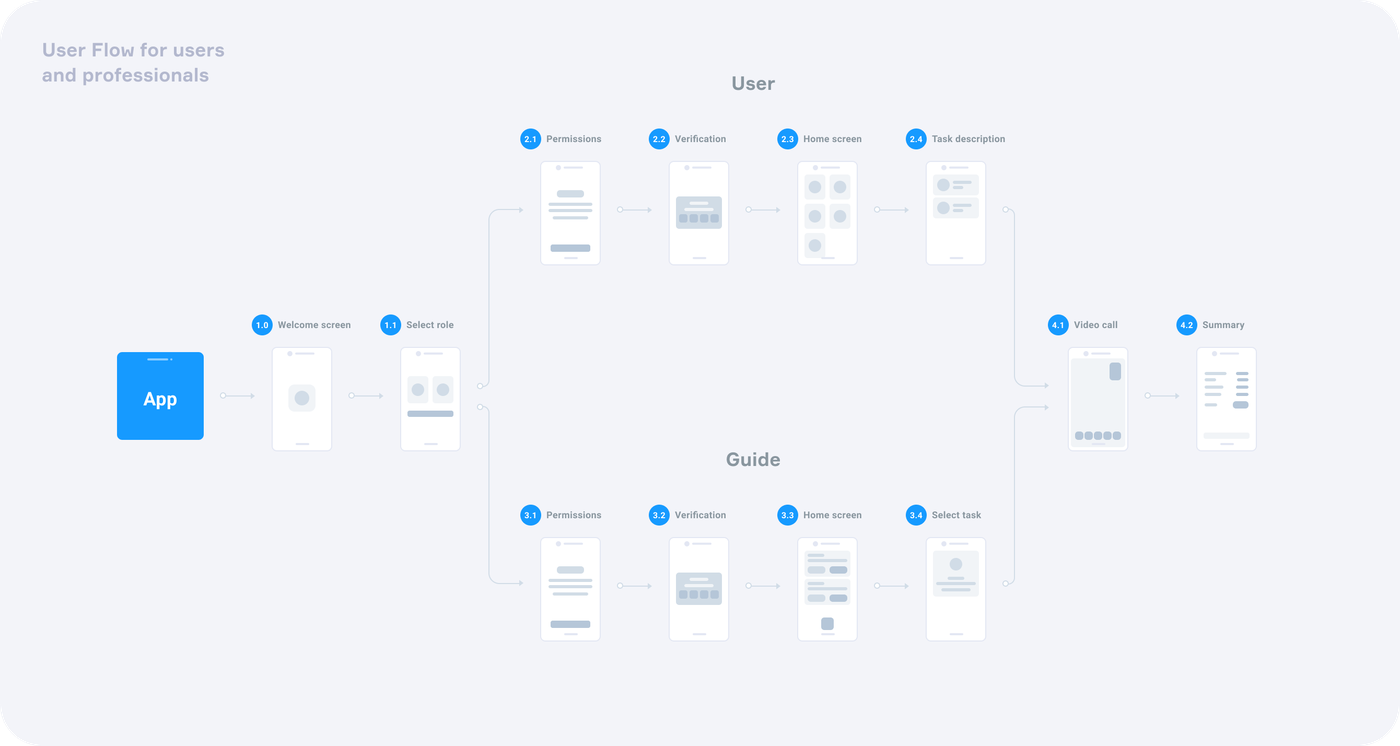
User path
The key feature of this application is its versatility — you do not need to download 2 applications separately for a user and a specialist. This approach has helped to greatly simplify development.
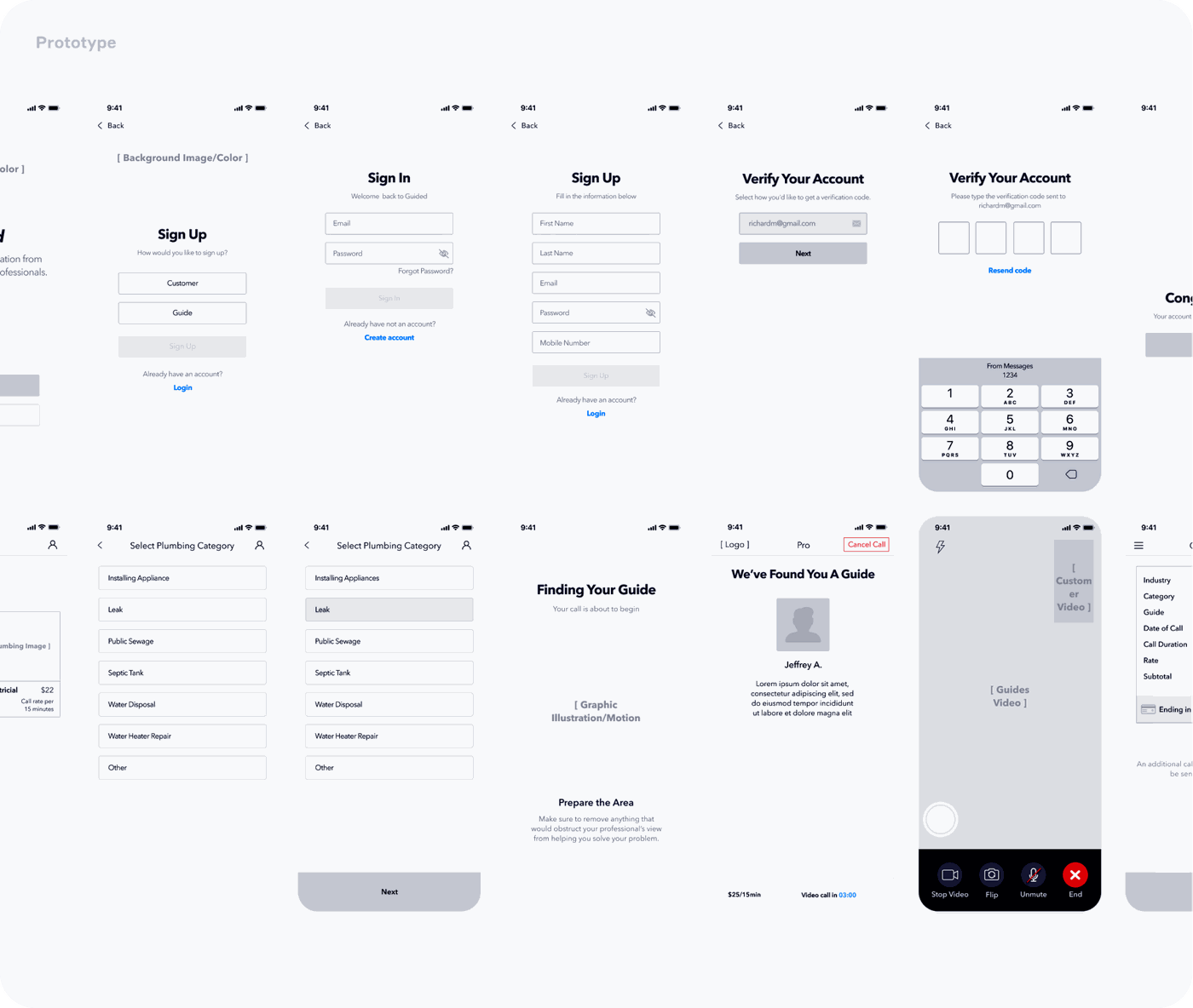
Prototype
Wireframes were developed first. Testing ideas and iterating are easier and faster on low-fidelity sketches. As a result, they were turned into beautiful and convenient screen prototypes.
To make the interface as smooth and enjoyable as possible, we used interactive prototypes. This provided a holistic view of how users interact with the product as a whole.
This approach has allowed us to:
Test and improve the new interface at the beginning.
Clearly understand the structure.
Demonstrate the features of the interface.
Visual style
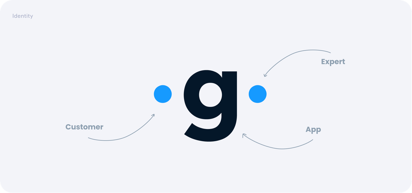
Before starting the design of the application, we developed a logo and visual style, which formed the basis of the future application.
The main task of the application is to connect the client and the expert through the interface to solve problems. We took this principle as a starting point when developing the logo and visual style.


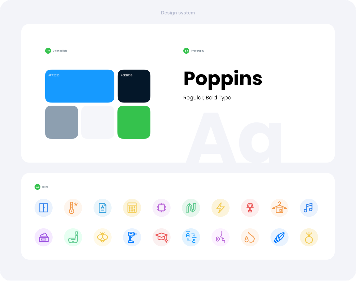
Interface elements
The design is based on the Superellipse principle, which helped smooth out any rough edges between the client and the professional, and also made the interface more user-friendly.
Application design
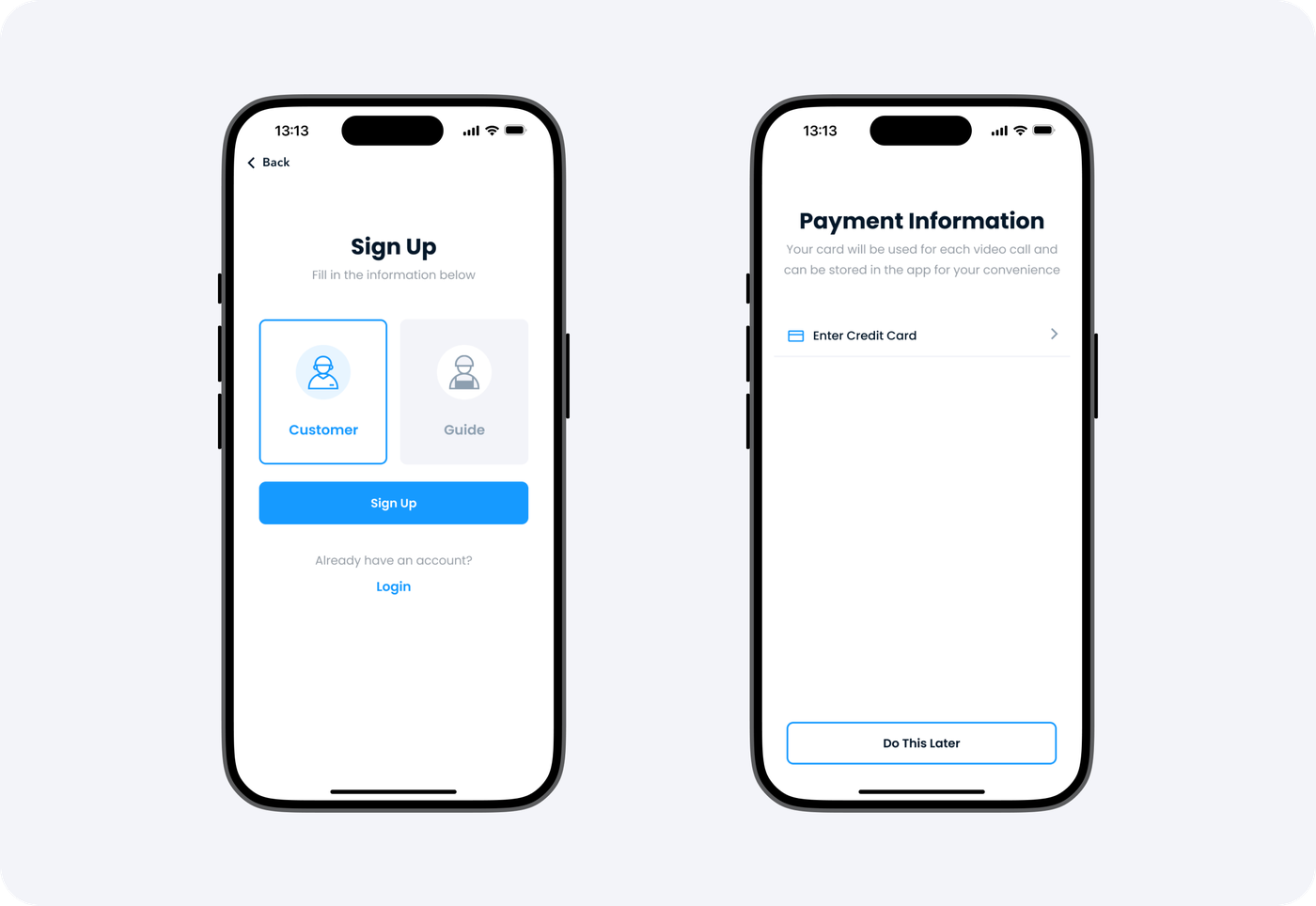
Registration
Already at the registration stage, you can choose in which role you will use the application: as a user who needs help, or as a professional.
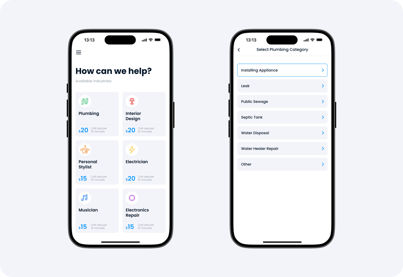
Home screen
First, we managed to solve the problem of quickly finding the appropriate category. We have displayed them on the main screen: the most popular are listed above, and you can see other categories using a scroll.
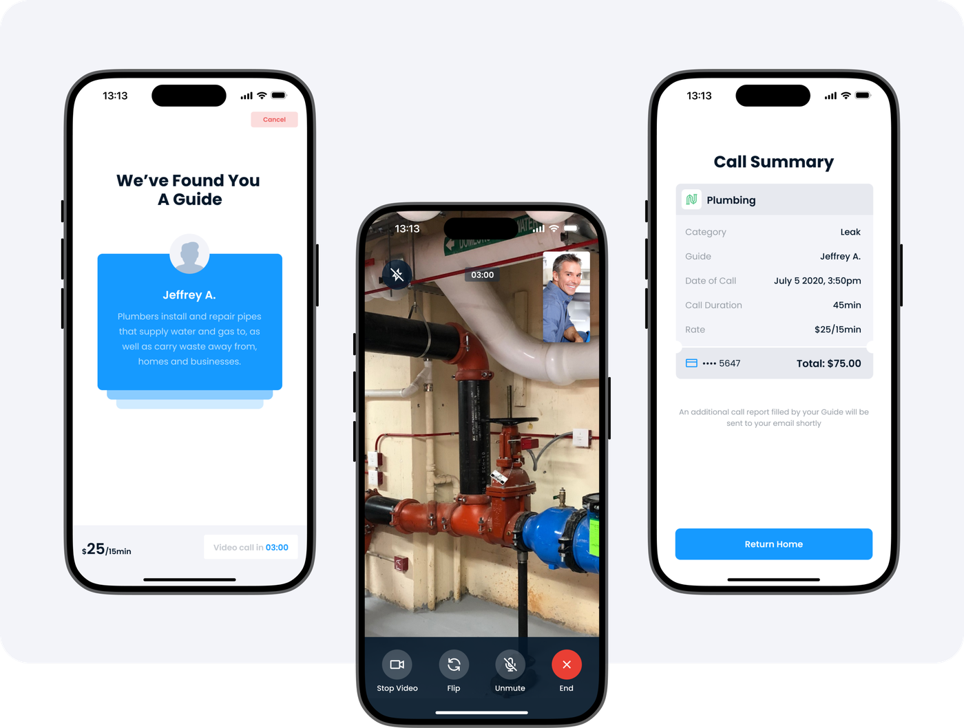
The choice of a professional
You can pick from a list of professionals exactly the one that you like best according to the description of their capabilities. After that, you will make a video call and receive a check.
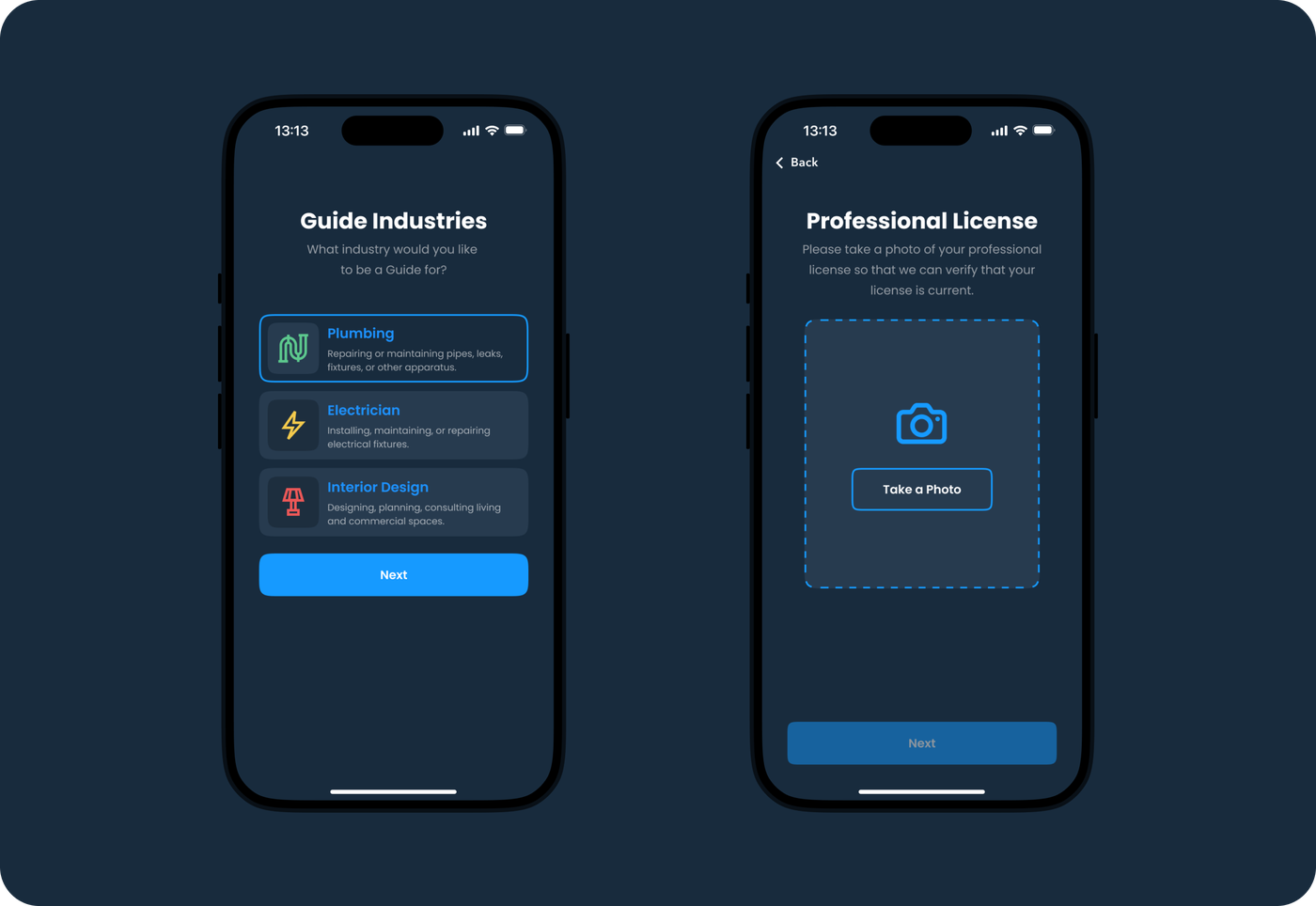
Application for the professional
Registration
Only licensed professionals can provide services in the application, so you will need to upload a photo of the document confirming professional training. To receive payments from the application, you need to create a Stripe account.
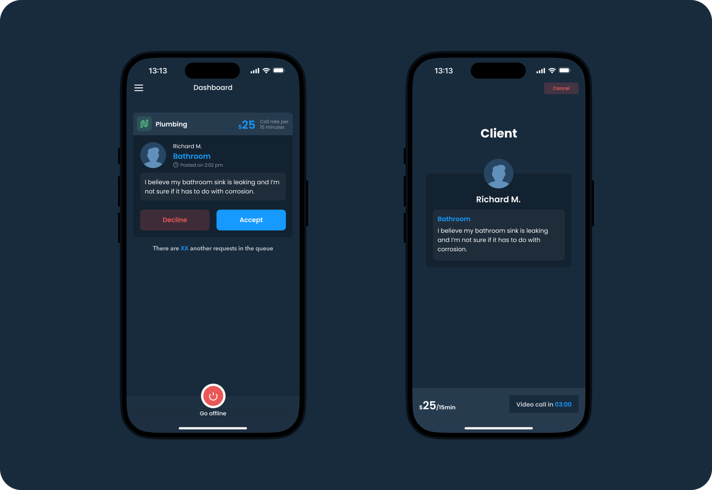
Home screen
A professional can choose from a pool of video consultation requests the one that best suits their specialization and experience.
If I had to use one word to describe my experience with Brights, it would be “overdeliver”. From initial exploratory conversations all the way through launch, the Brights team consistently overdelivered.
Related services
Online calculator SignalIntent
Request a quote.
Thanks for scrolling this far. Let's take the next step. Provide us with a brief description of what you are going to build.