Best Practices for Creating Effective SaaS UI/UX Design

Let’s imagine you’ve built a SaaS product based on a brilliant idea, and now it’s attracting numerous users thanks to marketing efforts. At this point, SaaS UI/UX design may seem like a wrapper for your product — after all, the core value proposition is what matters most. But in reality, design affects every aspect of your success.
“If the product isn’t intuitive and smooth from the very first seconds, chances are, your target users will go elsewhere (unless yours is the only product of its kind on the market, which is rarely the case). Good SaaS UI/UX design positively impacts user retention, conversion rates, reviews, your brand’s reputation, and even customer support costs. And vice versa: poor design decisions can lead to financial losses, both for you and your customers. For instance, a few years ago, Citibank employees made a $900 million mistake due to a confusing interface of the Flexcube software.”
— Maryna S., UX designer at Brights
When it comes to creating UI/UX for SaaS platforms, the pressure is high. But let us assure you, there are time-proven formulas for building a product that captivates users right away. As usual, Brights is here to share these fundamentals with you based on our experience with SaaS development. Keep reading for best practices from our designers, tips for overcoming challenges, and insights from Termix, one of our SaaS case studies.
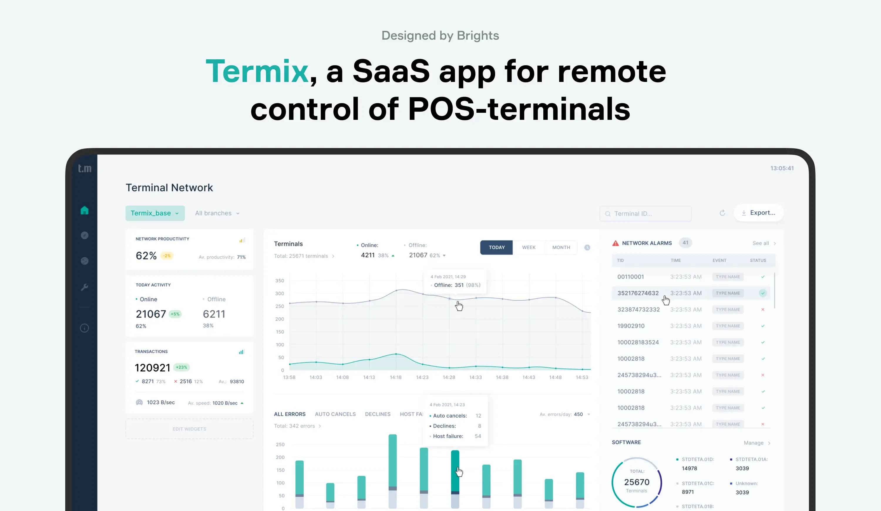
Termix, a SaaS application designed by Brights
Key takeaways
UI/UX design for SaaS platforms impacts every aspect of user interaction with your product. A well-crafted design can enhance user satisfaction and retention, reduce churn rates, help increase revenue, and improve overall business performance.
The most common challenges of creating SaaS UI/UX design involve navigating the complexity of a SaaS product, preparing it for future scaling, and addressing the product knowledge gap when onboarding design specialists.
Brights’ SaaS UI/UX workflow typically involves five stages: discovery, definition, prototyping, UI design, and validation.
After the product launch, it’s essential to measure and continuously monitor the effectiveness of UI/UX solutions. This can be done by tracking metrics like user retention rate, conversion rate, user error rate, heatmaps and click tracking, usability testing feedback, etc.
SaaS UX components to prioritize
Naturally, to determine which functionality your specific product requires, you need to study your audience’s expectations and conduct a comprehensive discovery phase. We get into this process in our SaaS development guide. In the table below, we focus on SaaS UX design components that most SaaS applications would benefit from, regardless of the specialization.
| UI/UX component | Why it matters |
|---|---|
| Easy sign-on and sign-in | Getting into your SaaS solutions should be painless and stress-free, so make sure to eliminate lengthy and complex forms. With secure options like Single Sign-On (SSO), users can dive right into your product without unnecessary barriers. |
| Engaging onboarding | First impressions matter. A swift, engaging onboarding process will ensure the user journey within your platform is natural and effortless. It will also allow users to see the value of your product from the get-go, boosting early engagement. |
| Intuitive navigation | The purpose of navigation is to make users feel comfortable, not overwhelmed. By using familiar layouts and clear menus when creating UX design for SaaS, you minimize frustration, help users find what they need, and keep them focused on what matters. |
| Progressive disclosure | As a rule, SaaS products are inherently complex, so avoid overwhelming your users and reveal information gradually, only when it’s needed. This approach helps them learn the platform at their own pace, making the learning curve less steep and the experience more pleasant. |
| Dashboards | By introducing this feature, you provide users with real-time insights and easy access to the tools they rely on most. A well-designed dashboard can help improve efficiency and keep users engaged by presenting the required data when needed. |
| Personalization | Relevant content, meaningful interactions, timely tailored notifications — all this helps your users feel understood. By analyzing user’s behavior and preferences, you can add more value to your SaaS and turn casual users into loyal advocates. |
| Customer support | Getting lost in a digital environment is frustrating, so your users need in-app support to be easily accessible. This can be a live chat or an intuitive and detailed help center, where they will find immediate assistance. |
| Self-service features | The point of self-service features is to give users the power to find solutions independently, while also reducing the load on your support team. Self-service features usually include a comprehensive knowledge base, step-by-step tutorials, community forums, easy access to account management tools, etc. |
| Security measures | Poor security measures will likely be a dealbreaker for users, especially if your product is a B2B SaaS. To win your customers’ trust, you must implement advanced security measures that protect user data at every step. These will include data encryption, regular security audits, secure API gateways, compliance with respective industry standards, etc. |
Best practices for SaaS UI/UX design
Creating effective UI/UX solutions is about crafting an experience that users find intuitive, efficient, and enjoyable. Let’s dive into some of the best practices to follow for SaaS UI/UX design.

Best SaaS UI/UX design practices from Brights experts
Study your audience
From the very beginning, you need to understand your audience’s pain points, goals, and behaviors. The better you know your users, the more effectively you can design a product that meets their expectations.
“The first and arguably most important thing in the SaaS UX design process is understanding who we’re creating this product for and which needs we must address. These insights come from user interviews and research. Only with this knowledge can we create something truly effective, something that delivers value.”
— Maryna S., UX designer at Brights
Ensure responsive design
A responsive, mobile-first design ensures that users have a seamless experience, whether they’re on a desktop, tablet, or smartphone. One of the smartest best practices for a successful SaaS UI/UX design is creating it for the smallest screen first and then scaling up. The thinking behind it is it will force you to prioritize essential features and streamline the user interface so your product is functional, no matter the device.
Prioritize accessibility
Accessibility is one of the important pillars of modern SaaS UI/UX design. By making your SaaS product accessible to all users, including those with disabilities, you reach a broader audience in addition to complying with legal standards. Consider aspects related to text readability, color contrast, keyboard navigation, and screen reader compatibility. An accessible design is a non-negotiable for ethical businesses that leave no customer behind.
“An important, though often overlooked aspect during development, is the accessibility of the product for different user groups. It can be challenging, especially for apps with a narrow specialization, but it’s crucial to anticipate future growth and design with a broader audience in mind.”
— Maryna S., UX designer at Brights
Establish trust with social proof
We humans are far more likely to trust a product if others have vouched for it. The same goes for SaaS products. Incorporating social proof like customer testimonials, user reviews, and case studies into your design can work wonders for your app’s credibility. After all, nothing builds trust faster than hearing how others have already benefited from what you’re offering. This is especially crucial in the SaaS world, where trust plays a key role in converting visitors into loyal users.
Create intuitive UI with mental models
A great UI isn’t just visually appealing — it feels right to the user. Mental models are the assumptions and expectations users bring with them from their past experiences. When the interface aligns with these mental models, navigating your product becomes much easier.
For instance, a magnifying glass icon for search and a trash can icon for delete are so ingrained in our collective digital experience that users don’t even think twice about what it does. By tapping into these familiar patterns, you create an interface that feels intuitive and requires little to no learning curve.
Icons in Termix, a SaaS app developed by Brights
Keep your design consistent
Consistency in design is about creating an experience that users can rely on. From button styles to typography to color schemes, every element of your UI should be coherent throughout the entire product and on multiple devices. When users know what to expect, they can interact with your SaaS more confidently and complete tasks efficiently.
“SaaS products contain enormous amounts of information, and it’s crucial to implement a properly structured design system so that users don’t get overwhelmed. Using consistent visual elements and similar functions helps users intuitively understand what to do in different situations.
Also, SaaS products continuously evolve and get new features, so the design system must be flexible. That’s why I develop design elements to be as adaptable as possible — not only for new screens but also for easy handoff to other teams.”
— Alina K., UI designer at Brights
Pay close attention to user feedback
Your users are the ones interacting with your product daily, so their insights are invaluable. We strongly advise you to seek feedback regularly through surveys, usability tests, and direct communication. But don’t just collect it — act on it.
“Whenever possible, we should stay connected with users and communicate with them continuously. However, not every company can afford ongoing user interviews, so there are alternative ways to gather insights. For instance, you can track analytics, attach short surveys to the products using tools like Hotjar, and analyze support requests. This is a very powerful tool for designers. Sometimes, finding 'critics' of our product in support requests can reveal what’s not working and how we can improve it.”
— Maryna S., UX designer at Brights
Overcoming common SaaS UX challenges
Designing successful UI and UX for SaaS comes with a number of challenges, and you need to be aware of them from the start to overcome them.
Navigating the complexity of SaaS
When designing user experience and SaaS interfaces, you have to find the right balance between making it feature-rich and keeping it user-friendly. As user expectations grow, they expect software that can do it all. Yet, the product still has to be intuitive to become their favorite. So, how do you make a SaaS app both highly functional and maintain usability?
If you’re building a SaaS platform from scratch, you might consider starting with an MVP (Minimum Viable Product) or MLP (Minimum Lovable Product) to focus on core functionalities without overwhelming users. Another good practice is progressive disclosure: this way, you introduce features gradually, as users become more familiar with the product. Ultimately, we recommend starting with the essentials, monitoring user feedback and requests, and revealing advanced options as needed.
Scaling up
Even if your product starts small, you need to prepare the UX design for SaaS growth from the start because rapid scaling can quickly expose any weaknesses in your architecture and user experience. The challenge here lies in ensuring that as your platform scales, its performance doesn’t crash under pressure.
Our primary advice is to design a solid architecture from the outset, making sure it can handle an increasing load without compromising on speed or reliability. You also need to choose cloud services that offer elastic scalability and consider modular design, which allows you to expand or optimize parts of the SaaS as needed. As a result, your SaaS product will remain smooth and responsive no matter how much it grows.
Addressing the product knowledge gap
Unlike traditional software, SaaS products keep constantly evolving, with new features and updates coming in regularly. This can make it really hard for designers who come fresh into the team mid-project to fully comprehend the core features of the product and how each of them satisfies customer needs. The knowledge gap can lead to design decisions that don’t fully align with the product’s objectives or current SaaS UI/UX design trends of your respective industry.
To overcome this challenge, you need to foster collaboration among your design team and encourage them to engage with users and the development department. Regular knowledge-sharing sessions and detailed documentation can also bridge this gap, ensuring that even new team members are equipped to contribute effectively to the product’s evolution.
If you’re outsourcing SaaS design and development, make sure your dedicated team has relevant industry knowledge. At Brights, we’ve worked with vertical SaaS across various industries, ensuring that our designs are tailored to meet the specific needs of each sector. However, if the industry is new to us, our UI/UX designers immerse themselves fully into the field, studying the niche requirements to ensure that every design decision aligns with the unique market and customer demands.
Brights’ workflow based on our case study
At Brights, we break down the SaaS UI/UX design process into five key stages, each consisting of a number of activities:
| UI/UX design stage | Activities the stage involves |
|---|---|
| Discovery | Stakeholder interviews User profiles Competitors’ analysis |
| Definition | Formation of hypotheses Hypotheses validation Formation of a features list Value proposition |
| Prototyping | User flow or site mapping Prototyping Prototype testing |
| UI design | Moodboard Design concept Concept presentation and validation Finalization of a chosen concept |
| Validation | Design guidelines Preparation for development |
We know that these might sound a bit too abstract. So, to give you a better idea of our UI/UX design process, we’ll guide you through its key aspects using an example of Termix, a SaaS product we designed for our client.
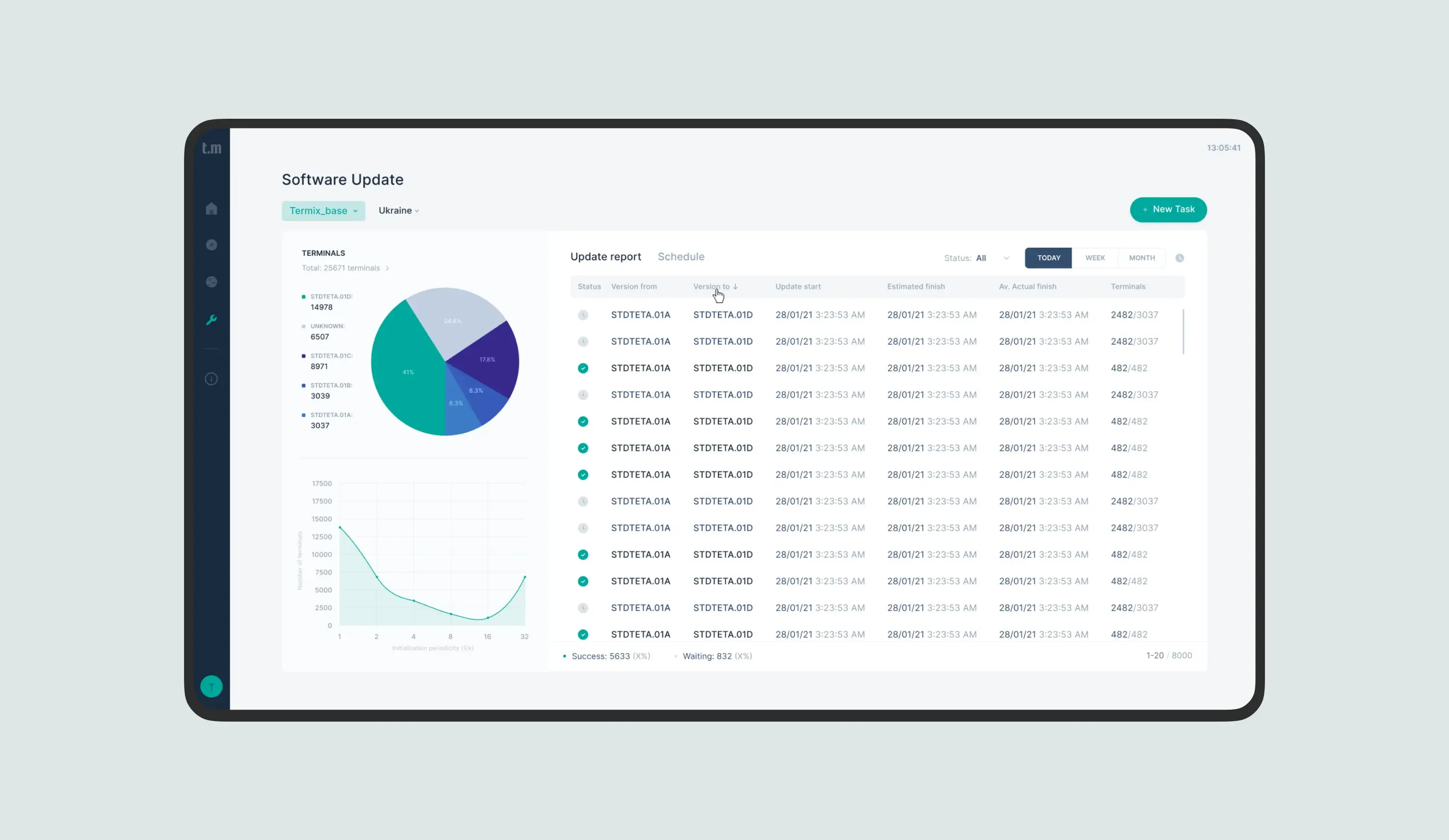
The monitoring module in Termix, a SaaS for remote control of POS-terminals. Designed by Brights.
Termix is a cloud-based app designed for the remote management, monitoring, and control of POS terminals within a bank's acquiring network. It provides real-time control and insights into each terminal, allowing operators to manage their terminal fleet efficiently from a distance. The system improves the overall efficiency of the terminal network, reduces maintenance costs, and accelerates the speed of technical support response.
When we started working on the project, our client had a current poorly structured product, which needed to be transformed. Therefore, we had to focus on three UI/UX goals:
Building a new navigation design and structuring different datasets properly;
Rethinking user journeys that affect the effectiveness of terminal network management;
Developing modern, clear interfaces and a scalable design system.
Below you will find a visualization of our process while working on Termix.

Brights’ UI/UX design process for Termix, a SaaS product
Step 1. Definition
Our first task was to get to the bottom of Termix’s user interactions. We knew that transforming a complex SaaS product like this required more than just a surface-level redesign — it needed a deep dive into how users actually work within the system.
During the definition stage, we mapped three distinct user paths that reflected the core interactions users would have with Termix. Each path was designed to cater to specific needs, ensuring that whatever the user’s task was, their journey through the app would be intuitive and efficient. The findings of this stage laid the foundation for a redesign that would work seamlessly in real-world scenarios.
Step 2. Prototyping and UI design
Once we had a clear understanding of the user paths, it was time to bring them to life with prototypes and detailed SaaS UI design. We developed a high-fidelity prototype that incorporated all the new functionalities and structural solutions envisioned in the earlier phase. To test our assumptions, we created three interactive user paths for each hypothesis and validated them with real users. Their feedback helped us fine-tune the prototypes to meet real customer needs better.
As for the SaaS UI part, we created over 80 screens, ensuring every aspect of the Termix interface was covered. Our design choices were deliberate: calm teal, gray, and navy tones helped make complex data more digestible visually, while minimalist icons and modern fonts enhanced clarity and navigation. Throughout this process, the Brights team built a scalable design system that would support Termix’s evolution.
Step 3. Delivery
The product underwent a significant transformation in three months of our collaboration with the client. The UX audit and user testing provided us with critical insights needed to refine navigation and data hierarchy, making Termix more user-friendly and powerful in terms of monitoring and control.
We took modern design principles and applied them across the board, creating a scalable system that could grow alongside the product. In the end, we delivered a highly functional SaaS application design that helps Termix stand out in the market, both in terms of business effectiveness and user experience.
Cost of implementing UI/UX in SaaS
Each SaaS product is unique, so before we get down to the actual numbers, let’s determine the key factors that affect the UI/UX design costs:
SaaS project size. Larger projects with more features require more extensive design work, which naturally increases costs. A small, focused SaaS application will cost less to design than a comprehensive, multi-feature platform.
Design complexity. The more intricate the design, the higher the cost. A minimalist interface with straightforward user journeys will generally be less expensive than one with advanced animations or complex user flows.
Team composition. Whether you choose to go with an in-house team or outsource the work can significantly impact your budget. In-house teams, depending on your location, can be costly due to salaries and benefits. Outsourcing can offer cost savings, especially if you work with a design firm in a region with lower hourly rates.
The cost of SaaS UI/UX design at Brights
When clients outsource their SaaS UI/UX design to Brights, we typically suggest they get a comprehensive approach that includes Business Analysis (BA) to ensure the design is aligned with their business goals. Here’s a breakdown of average costs when you partner with us:
Prototyping: Around $7,000 (including BA)
UI/UX Design: Approximately $9,000 (including BA)
While the upfront UX and SaaS interface design cost may seem substantial, these decisions can determine your return on investment (ROI) later. Here’s why investing in a good UI/UX design is cost-efficient in the long run:
Higher user satisfaction. A seamless, intuitive UI/UX makes users more likely to stick around and keep returning to your SaaS, lowering the churn rate.
Increased customer loyalty. Users who enjoy using your SaaS are more likely to become loyal customers and even brand advocates, spreading the word about the app.
Cost avoidance. Investing into UI/UX design from the start helps avoid expensive redesigns later on, saving you money and headaches down the road.
Lower customer support costs. With an intuitive SaaS user experience and UI design, users can navigate your product easily on their own, meaning your support team will focus on complex issues rather than basic usability questions.
Proper UI/UX is a significant investment, but we at Brights ensure that every dollar our clients spend on it delivers maximum value. For a more detailed cost breakdown of the entire product-building process, be sure to check our article on SaaS development costs.
Measuring the success of your SaaS UI/UX

KPIs to track the effectiveness of your SaaS UI/UX
The process of UI/UX design heavily relies on data-based evidence — and with the product’s launch, it doesn’t end. While making prototypes and finalizing the design part, we validate our hypotheses with prospective users. However, we still have to monitor how the broad audience interacts with the final product to make additional adjustments if necessary. After all, SaaS solutions are all about growing and providing value to users non-stop — otherwise, the subscriptions won’t be justified.
The key performance indicators used to measure the efficiency of SaaS UI/UX design are included in the table below.
| Metric | How it works | Useful tools |
|---|---|---|
| User retention rate | The percentage of users who continue to use the product over time, which indicates satisfaction with the UI/UX. | Mixpanel, Amplitude |
| Conversion rate | The percentage of users who complete a desired action, such as signing up, completing a purchase, etc. The higher the conversion rate, the more effectively the design guides users toward their goals. | Google Analytics, Hotjar |
| Task completion rate | The percentage of users who successfully complete a task without stumbling upon errors or getting frustrated. The metric highlights how intuitive and efficient the design is for specific objectives. | UsabilityHub, UserTesting |
| Time on task | The average time users spend completing a task. Shorter times usually indicate a more efficient and user-friendly design. However, it depends on the task's complexity. | UsabilityHub, UserTesting |
| User error rate | The number of mistakes users make when interacting with the product. Low error rates indicate a clear and easy-to-navigate interface that doesn’t confuse users. | Crazy Egg, Hotjar |
| Net Promoter Score (NPS) | User satisfaction level, measured by asking if they would recommend the product to others. | Delighted, Wootric |
| Customer Satisfaction Score (CSAT) | User satisfaction level determined through surveys after key interactions. High CSAT scores prove that UI/UX meets or exceeds user expectations. | SurveyMonkey, Qualtrics |
| Bounce and churn rates | The bounce rate indicates the percentage of users who leave after viewing only one page or screen. The churn rate is about the number of users who stop using the product over a specific period. | Mixpanel, Amplitude, Google Analytics |
| Heatmaps & Click tracking | Visual tools that show where users click or spend the most time on a page, helping you identify which design elements are effective and which may need improvement. | Hotjar, Crazy Egg, Mouseflow |
| Usability testing feedback | Direct insights from users during usability tests, highlighting areas of the design that work well and those that cause frustration or confusion. | UserTesting, Lookback |
Conclusion
The key takeaway from this article (and every successful SaaS case out there) is that SaaS UI/UX design matters. It has the power to dramatically improve your user retention, reduce churn rate, lead to increased revenue, and ultimately help your product get a strong market position. There is a reason why SaaS platforms like Slack, Salesforce, and HubSpot are the gold standard, and it’s not just about brilliant ideas, but also about showing these ideas to customers convincingly enough from the first seconds of the user journey.
What we’ve learned from global and our own experience is that the best SaaS platforms are those that make users feel like everything is just where it should be. They are clear, responsive, consistent, and accessible, ensuring users can actually complete their goals and enjoy the process. We at Brights know how to achieve this — and will happily share our expertise in UX, UI, and SaaS consulting services to help you turn great ideas into successful, scalable products.
FAQ.
Users of SaaS products spend hours navigating complex workflows, managing data, and accomplishing specific tasks rather than just consuming information. Therefore, you need to design for repeat usage, feature discovery, and user onboarding that gradually reveals functionality without overwhelming newcomers. Unlike marketing websites that focus on conversion, SaaS interfaces must balance simplicity for new users with powerful functionality for experienced ones.

