How to Build Product KPI Dashboards in Looker Studio That PMs Actually Use

A PM at a mobile SaaS company starts their morning and opens their product KPI dashboard in Looker Studio. Within seconds, they see that last week's feature release boosted engagement by 12%, identify which customer segments need attention, and spot the usage patterns that should drive this week's backlog priorities. Everything they need to make informed product decisions is right there.
Many product teams are still working toward this level of clarity. They cobble together insights from scattered sources — Amplitude, Mixpanel, GA4, endless spreadsheets. The result is hours spent hunting for answers.
At Brights, we've helped numerous product teams transform their scattered metrics into focused, actionable dashboards. In such projects, we often turn to our Looker Studio experts due to the tool’s seamless integration with existing data sources, collaborative sharing features, and zero licensing costs that make it accessible even for startups.
The guide below walks you through building product management KPI dashboards that PMs actually use, from selecting the right metrics and structuring data around the user journey to designing views that different stakeholders can act on right away.
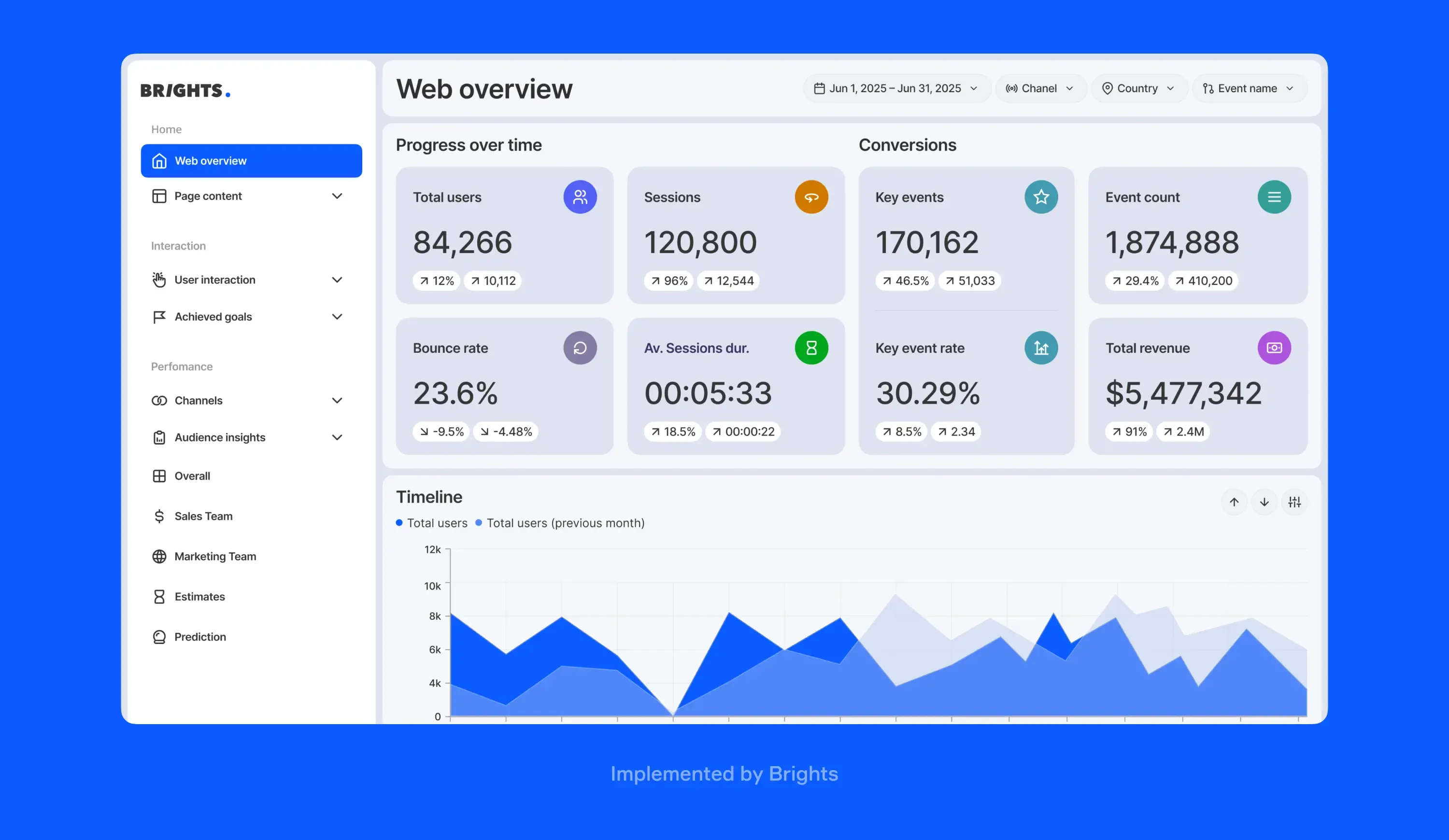
Looker Studio dashboard implemented by Brights
Key takeaways
Product KPIs reveal user behavior patterns that help teams make better development decisions, while revenue metrics only show business outcomes after the fact.
Organizing dashboards into daily operational, weekly tactical, and monthly strategic views matches natural decision-making rhythms and prevents important signals from getting buried.
Limiting dashboards to 5-7 key visualizations prevents information overload and ensures teams can view all critical product metrics to measure in dashboard views.
Role-specific dashboard views with shared "North Star" metrics ensure stakeholders see relevant information while maintaining alignment on overall product health metrics dashboard data.
Dashboards that challenge assumptions about user behavior often reveal surprising patterns that contradict internal beliefs and lead to breakthrough product decisions.
What product management KPIs you need to track in Looker Studio?

Product KPIs aren't business KPIs, and that distinction matters more than your team might realize. While executives focus on revenue and growth rates, you need metrics that show how people actually use the product you’re working on. Are they adopting new features? Do they stick around after onboarding? What makes them engage in a meaningful way?
The right product metrics help you make better bets about what to build next, when to pivot, and where to invest engineering resources. Here's how to organize them:
| Metric category | Key indicators | What it tells you |
|---|---|---|
| Adoption | DAUs/MAUs, feature activation rate, time-to-first-value, onboarding completion rate | How quickly users discover and start using core features |
| Engagement | Session frequency, session duration, feature usage depth, pages per session, click-through rates | How actively users interact with your product |
| Retention | Day 1/7/30 retention, churn rate, product stickiness ratio, cohort retention curves | Whether users form lasting habits with your product |
| Customer health | NPS, CSAT, support ticket volume, feature request frequency, user sentiment scores | What users think and where they struggle |
| Product performance | Page load times, error rates, crash frequency, API response times | Technical barriers that impact user experience |
“The key difference between product and marketing dashboards comes down to what you're optimizing for. Marketing boards focus on campaign effectiveness — advertising costs, CTR, and conversion rates from different channels. Product dashboards dig deeper into user behavior: MAU/DAU ratios, feature usage patterns, retention curves. For example, with a fitness app client, we showed not just how many people started workouts, but which training types had the highest completion rates and drove long-term engagement. That's the insight that helps you build better features.”
— Anastasiia L., project manager and Looker Studio expert at Brights
Understanding metrics and KPIs helps you choose the right indicators for your specific product type, but the goal remains the same: track what drives user success, not just business success.
For choosing the right indicators for your specific product type, refer to our SaaS metric guide.
How to build a product dashboard in Looker Studio?
At Brights, we've built product dashboards for teams ranging from early-stage startups to enterprise SaaS companies. Through dozens of implementations, we've refined the process that help create product KPI report Looker Studio solutions for better decision-making. Working with a reliable SaaS development services company ensures your dashboards are aligned with best practices in SaaS architecture and functionality, making product insights actionable and scalable.
Step 1. Start with product objectives, not available data
The common mistake product teams make is building backwards from whatever data they can easily access, which leads to dashboards full of vanity metrics. Instead, we recommend defining what product success means for your context and choosing product management KPIs to track based on that.
Write down the three most critical questions your dashboard needs to answer weekly, then identify required data sources. If your key question is "Which features drive long-term retention?", you'll need a user retention KPI dashboard that connects user behavior data to retention cohorts, not generic engagement metrics.
Step 2. Map data sources to user journey stages strategically
Connect tools that capture different user experience parts: Google Analytics for acquisition, product analytics (Mixpanel, Amplitude) for in-app behavior, support tools (Zendesk, Intercom) for friction points, and survey platforms for sentiment data. Additionally, partnering with skilled LMS developers for hire can help integrate learning management data into your dashboards, providing a full view of user engagement and course performance across your educational platform.
Pro tip: Use Google Sheets as a bridge for manual data like feature flags, release notes, or competitive intelligence. This creates complete context without complex integrations. Ensure each journey stage has two data sources to validate insights and catch blind spots.
Step 3. Structure dashboards by decision-making frequency

Create three layers matching how teams work: daily operational metrics (system health, support spikes, core usage), weekly tactical insights (A/B results, feature adoption, segment performance), and monthly strategic overviews (retention cohorts, roadmap impact).
Place fast-changing metrics at the top, slower-moving context below. Include time-to-load indicators. If something takes over 10 seconds to refresh, stakeholders won't use it consistently.
Step 4. Design role-specific views with shared context
Build separate pages for different roles, but start each with the same “North Star” section showing overall product health metrics dashboard data. PMs need granular usage data, executives want trends summaries, and designers aim to focus on UX pain points.
Include anomaly alerts, automated highlights when metrics deviate significantly from normal ranges. For instance, if feature adoption drops 20% week-over-week, flag it with context about recent releases.

Step 5. Build interactive Looker Studio product analytics dashboards
Add dynamic date ranges, segmentationfilters, cohort comparisons, and drill-down capabilities. Create investigation pathways — pre-built filter combinations for common hypotheses. If engagement drops, provide quick filters for new vs. returning users, mobile vs. desktop, and recent releases. This reduces investigation time from hours to minutes.
Product management dashboard best practices: Design insights from Brights
Aesthetic dashboards make no sense if they don't change decisions. After building multiple product performance dashboard Looker Studio solutions, we've identified patterns that separate dashboards teams love from ones they abandon. Here are the key pieces of advice from Anastasiia L., project manager and Looker Studio expert at Brights.
Keep it minimal: up to 5-7 key visualizations
“Avoid overloading with graphs and tables — it's better to have 5-7 key visualizations on the board so that you don't have to scroll. If loading takes more than 10 seconds, break it into smaller, focused boards. This constraint forces teams to prioritize what truly drives decisions.”
Group information by user journey, not data source
Structure your product dashboards around the user path: sign up → first action → repeat usage → upgrade. This differs from marketing dashboards that follow funnel stages (impressions → clicks → installs → revenue). When users can follow the logical flow of how customers interact with your product, insights become immediately actionable.
Create hierarchical views for different audiences
“It's important to correctly group information — you can create a general board with all absolute indicators, and add specific ones for platforms below it. Absolute data is important for C-level, while broader information will not be needed by everyone. This tiered approach ensures executives get a strategic overview while product teams access detailed behavioral data.”
Choose trend visualization over point-in-time snapshots
Static numbers tell you where you are, and trend lines tell you where you're headed. Use line charts showing 30-day rolling averages instead of current-day metrics. This reveals patterns that daily fluctuations might hide and helps teams spot concerning trends before they become critical issues.
Integrate qualitative feedback directly into quantitative views
You can enhance your dashboards by embedding recent NPS comments, support ticket themes, or user survey responses alongside your charts. When engagement drops 15%, seeing actual user quotes about confusing navigation provides context that pure numbers can't. This combination helps teams understand not just what happened, but why it happened.
Ultimately, when you build product dashboard Looker Studio solutions, keep in mind that your goal should not be comprehensive reporting but enabling faster, better-informed product decisions with the clearest possible signal-to-noise ratio.
What are the most common product KPI dashboard examples and use cases?
Product team KPI dashboard Looker Studio solutions succeed or fail depending on whether they answer questions that lead to immediate action. The most effective dashboards connect directly to the decisions product teams make weekly. When a PM opens their dashboard Tuesday morning, they should know within a minute whether last week's feature release improved user engagement, which customer segments need attention, and what should move to the top of this sprint's backlog.
Let’s go over the most common use cases.
| Use case | Dashboard view | Key decision enabled |
|---|---|---|
| Sprint planning | Side-by-side comparison of user requests vs. current feature usage with development effort estimates | Prioritize high-impact, low-effort features that users actually want |
| Feature launch reviews | Before/after adoption curves with cohort breakdowns and support ticket categorization | Decide whether to double down, iterate, or rollback based on user response patterns |
| Roadmap prioritization | Revenue impact calculator showing projected value of each initiative against competitive feature gaps | Align quarterly investments with features that drive both user satisfaction and business growth |
| Release performance | Real-time health monitoring with alert automation for performance degradation or user experience issues | Catch and resolve critical problems before they escalate to customer-facing incidents |
| Stakeholder updates | Progress-to-goal visualization with milestone completion rates and resource burn-down charts | Justify budget requests and timeline adjustments with concrete delivery metrics |
| Customer health monitoring | Early warning system combining usage decline, support interactions, and sentiment score changes | Identify at-risk accounts before they churn and trigger targeted retention efforts |
Product teams use dashboards most effectively during regular performance reviews when presenting analytics data to stakeholders and management, but the real value comes from daily operational decisions. When engineering velocity drops, a KPI dashboard for product managers Looker Studio offers can help spot it early, connect it to delayed feature launches, and adjust roadmaps accordingly.
“One of our clients, an athletics management app, recently discovered this firsthand. They were relying on Excel spreadsheets from dozens of institutions using their product. After we built them a unified Looker Studio dashboard, they could immediately see which app features were most and least popular across all clients. This daily visibility helped them identify upselling opportunities and prioritize product improvements based on actual usage patterns.”
— Anastasiia L., project manager and Looker Studio expert at Brights
Cases like this athletics app show how the right dashboard design transforms scattered data into clear action items. Understanding how to build funnel views that support business decisions helps you create similar views that reveal where users drop off and why, turning abstract metrics into specific improvement opportunities that teams can act on immediately. Product usage analytics in Looker Studio transforms these insights into actionable patterns.
Conclusion: Building your product KPI dashboard in Looker Studio
Effective product dashboards aren't the ones with the most data but the ones that challenge what you think you know about your users. A well-designed Looker Studio product analytics dashboard reveals uncomfortable truths that contradict internal beliefs but lead to breakthrough insights.
Looker Studio's strength lies in rapid hypothesis testing: build a view, filter by user cohort, spot a pattern, and adjust your roadmap the same day. This speed separates product teams that react to problems from those that prevent them by turning data into actionable intelligence rather than just pretty charts. If you're ready to move from reactive reporting to proactive product intelligence, our team at Brights would love to help you design dashboards that challenge assumptions and reveal opportunities hiding in your data.
FAQ.
A product metrics dashboard in Looker Studio focuses on user behavior, feature adoption, and product health metrics that inform development decisions. SaaS business dashboards track revenue, customer acquisition costs, and financial KPIs that guide business strategy and growth investments.

