Step-by-Step Creating a Funnel Visualization in Looker Studio for SaaS OG
Working with SaaS clients, we keep hearing the same story: decision-makers know their marketing is driving signups and their sales team is closing deals, but the middle part — the part where prospects either convert or disappear — is kind of a black box. Looker Studio funnel visualization promises to solve this visibility problem. Yet, SaaS teams often get lost trying to wrangle GA4's event data into something that resembles their customer journey.
We get this frustration. GA4's event-based structure can feel like it was built for data scientists. So, if you're drowning in sessions, events, and conversions that don't map cleanly to your SaaS metrics, you’re not alone.
At Brights, we've helped SaaS companies solve this problem by building custom dashboards that turn invisible drop-offs into clear opportunities for improvement. We've created Looker Studio funnel for product analytics of a SaaS app, a sales funnel tracking system for a medtech company, predictive analytics solutions for businesses, and more. Each implementation has proved that visibility changes everything.
With this guide from Brights’ Looker Studio consultants, you'll learn how to connect your messy GA4 data to clean, actionable funnel visualizations that update automatically and bring you valuable optimization insights. By the end, you'll have a dashboard that turns your customer journey into a roadmap for growth, with no data science degree required.
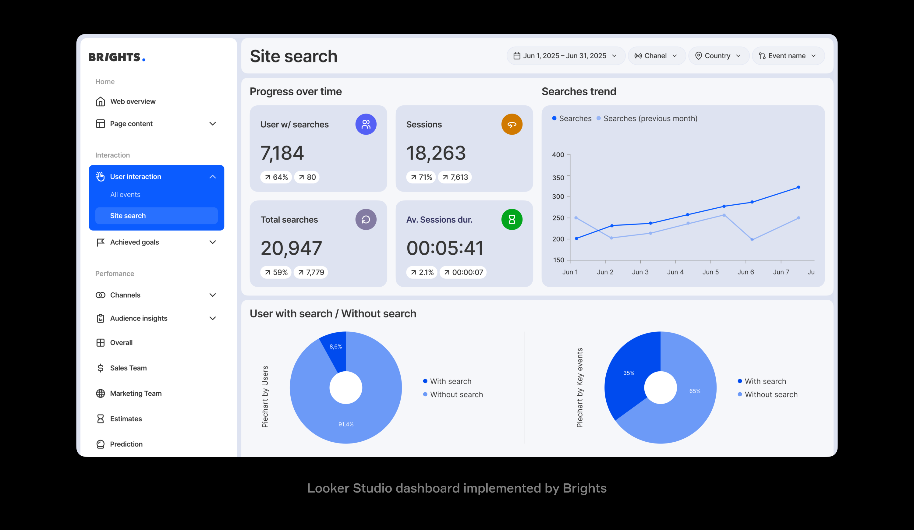
Looker Studio dashboard implemented by Brights
Key takeaways
Start with business logic, not charts: define your customer journey stages before touching any visualization tools.
4–6 funnel stages are the sweet spot. With more, your team will find it hard to pay attention, and with less, you might miss critical drop-off points.
GA4 direct connection limits you to 90 days, but using BigQuery integration for unlimited historical data will help achieve long-term SaaS cycle analysis.
BigQuery preprocessing solves complex attribution by handling user deduplication, attribution windows, and segmentation upstream before Looker Studio visualization.
Consider combining GA4 behavioral data with CRM and email metrics for complete revenue attribution.
Focus on conversion rates, not just volume metrics. Stage-to-stage conversion percentages reveal optimization opportunities that raw numbers might miss.
Why SaaS funnels fail in standard dashboards, and when Looker Studio makes sense
Funnel visual charts in SaaS analytics entail tracking how users progress through defined stages of your customer journey, from initial awareness to paying customer and beyond. Whether you're building marketing and sales funnel visualization or product adoption tracking, it's about understanding where people enter your ecosystem, where they get stuck, and where they successfully convert.
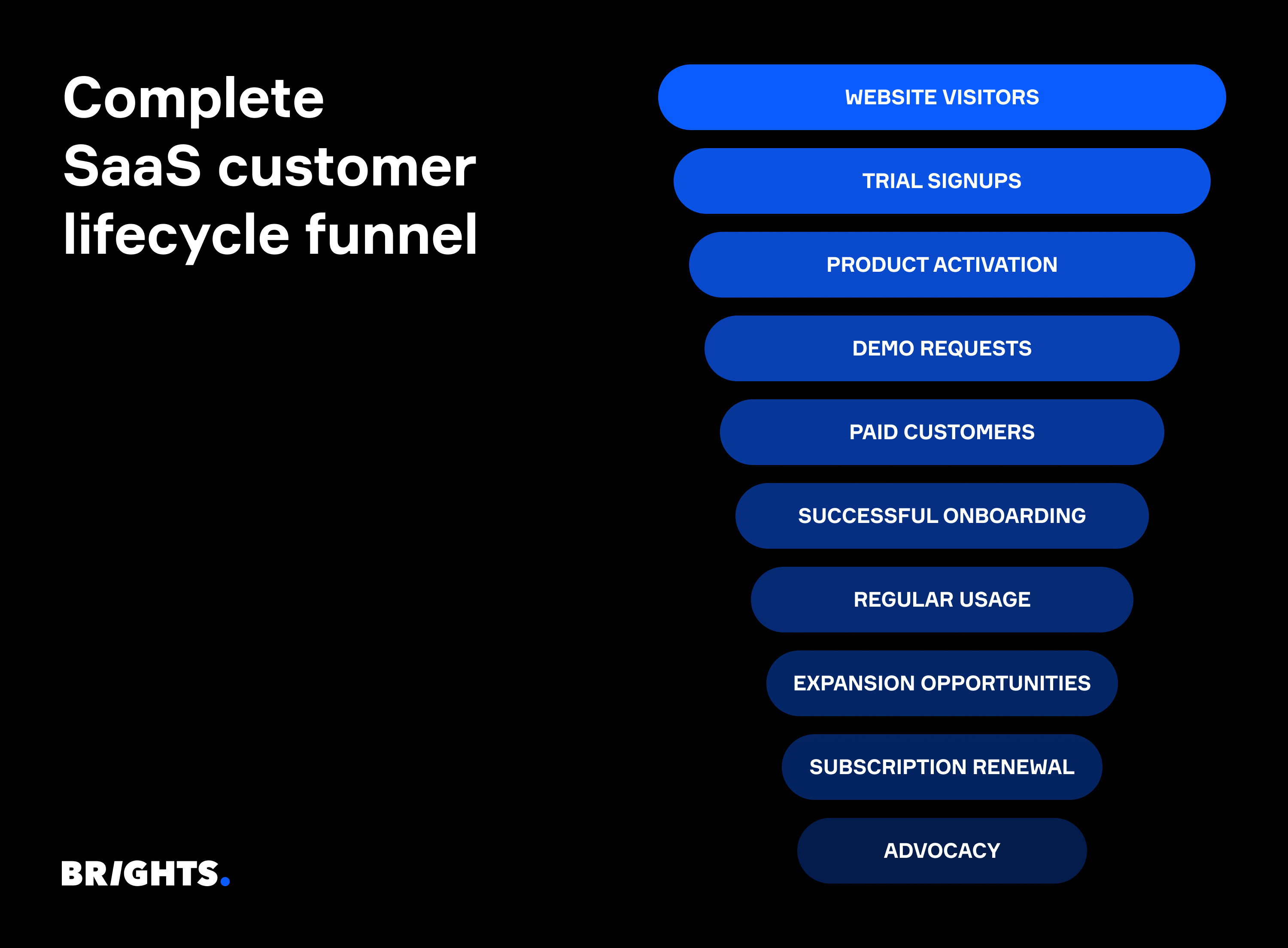
The problem with standard dashboards lies in their one-size-fits-all approach. Google Analytics shows you sessions and pageviews, but it doesn't easily translate into meaningful SaaS metrics like “trial-to-paid conversion” or “feature adoption rates”. Your CRM tracks deals, but misses the early-stage user behavior that predicts conversion likelihood. Product analytics tools show feature usage, but can't connect that back to marketing attribution.
Unlike static reports, Looker Studio offers:
Complex data transformed into visual charts that non-technical teams can understand immediately;
Dashboards customized to match your exact business logic instead of forcing metrics into generic templates;
GA4 integration happens automatically, without manual exports or data manipulation;
Multiple data sources blend into unified views showing complete customer journeys.
When do SaaS teams need funnel dashboards?
SaaS teams turn to funnel dashboards when they realize that business-critical questions can't be answered with standard reports. They need visibility into complex, multitouch customer journeys that span weeks or months.
| Looker funnel use case | Funnel type | Funnel stages | Business impact |
|---|---|---|---|
| Demo-to-paid conversions | Sales funnel | Demo request → Qualified demo → Trial signup → Payment | Revenue forecasting, sales efficiency |
| Multistep onboarding | Activation funnel | Signup → Email verification → Profile setup → First value milestone | User activation rates, time-to-value |
| Retention tracking | Engagement funnel | Monthly active → Feature adoption → Usage threshold → Renewal | Churn prediction, expansion opportunities |
| Campaign attribution | Marketing funnel | Ad click → Landing page → Lead form → MQL → Customer | Marketing ROI, channel optimization |
| Product adoption | Feature funnel | Login → Feature discovery → First use → Regular usage → Power user | Product development priorities, user success |
| Content engagement | Content funnel | Blog visit → Newsletter signup → Resource download → Demo request | Content ROI, lead qualification |
| Freemium conversion | Upgrade funnel | Free signup → Feature limit hit → Upgrade prompt → Payment | Pricing strategy, feature gating |
| Customer expansion | Growth funnel | Existing customer → Usage increase → Upsell trigger → Plan upgrade | Revenue expansion, account growth |
Horizontal funnel charts are the point where most teams hit a wall. These basic visualizations show simple drop-offs but fail to capture the nuanced, non-linear journeys that define modern SaaS customer behavior. Users don't move in straight lines: they might skip steps, return later, or engage with multiple touchpoints before converting.
At Brights, we help SaaS companies move beyond basic funnel charts to create dynamic visualizations that reflect real customer behavior.
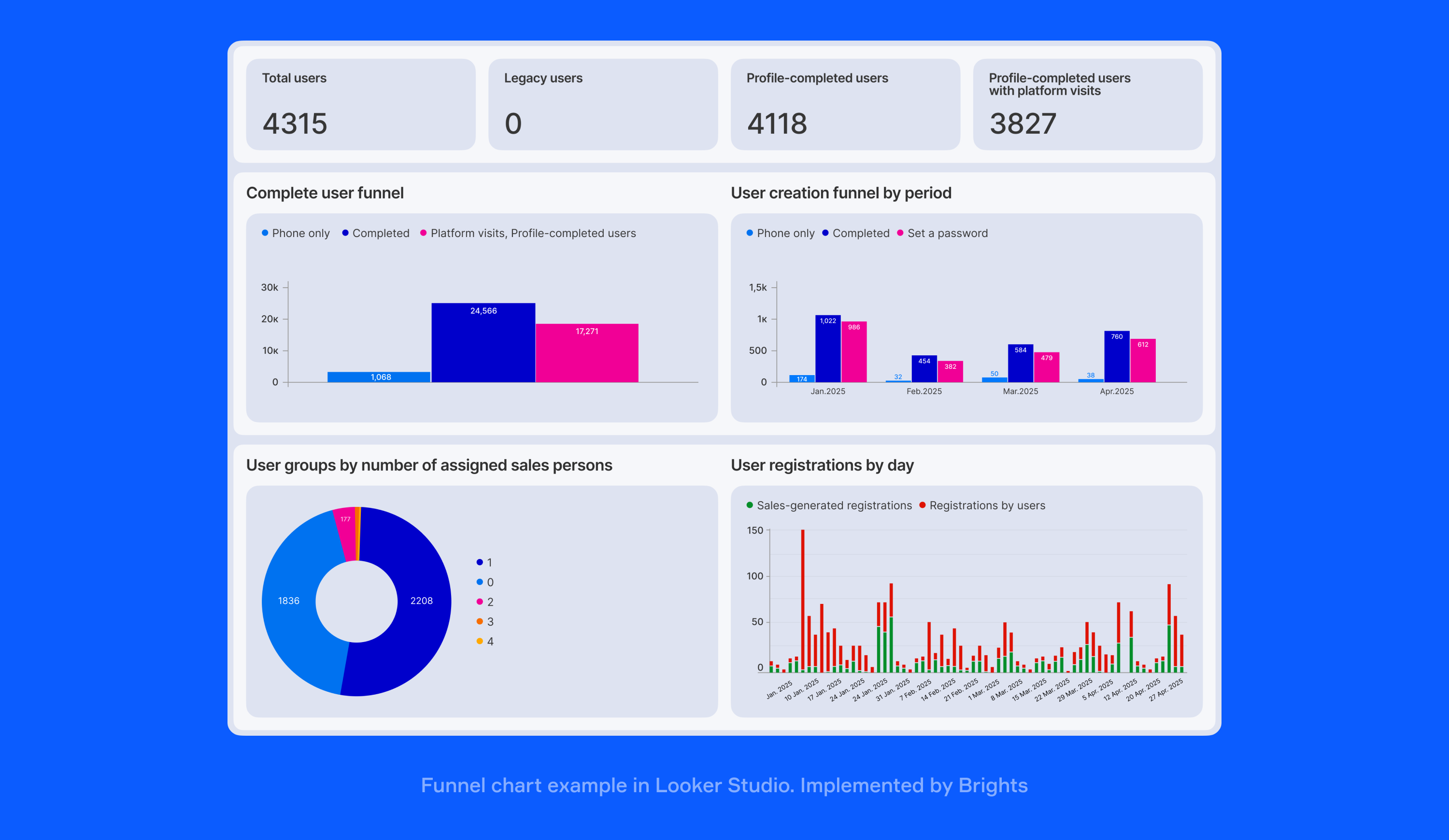
Funnel chart example in Looker Studio. Implemented by Brights
“We have a medtech client whose sales teams needed to see the connection between doctor engagement on their platform and actual sales performance. They had data on professionals in their respective fields, including sign-ups, lecture attendance, and web portal usage, but it was all scattered. We built them a Looker Studio funnel visualization that connected user engagement activities to sales outcomes by region and specialty. We also track user registration stages, what level they reach within the platform, and what specific engagement they provide at different points in their journey.
Now our clients can see which types of engagement lead to better sales rep performance and adjust their strategies accordingly. It's one of those cases where having the right visual made the critical patterns obvious.”
— Anastasiia L., project manager, Looker Studio expert at Brights
Looker Studio funnel visualization chart options
When building SaaS funnels in Looker Studio, you have multiple visualization paths depending on your data complexity and team needs. Understanding these options upfront saves hours of rebuilding later.
Native chart options
Looker Studio's built-in charts handle most basic funnel needs effectively:
Bar charts work best for simple tracking when you build a SaaS conversion funnel in Looker Studio, especially where you need to compare stage-by-stage performance across different time periods or user segments.
Scorecard visualizations excel at highlighting single metrics like overall conversion rates or current month performance versus targets.
Table formats provide detailed breakdowns when stakeholders need to see exact numbers behind each funnel stage, especially useful for executive reporting.
Custom visual plugins
For advanced funnel visualization, two plugins dominate the SaaS space:
RedNavel funnel charts offer true funnel-shaped visualizations with customizable colors and drop-off annotations that make stakeholder presentations more compelling.
Databloo's advanced charts provide sankey diagrams and multi-path funnels that better represent complex user journeys with multiple entry and exit points.
GA4 integration strategies
The most reliable funnel setups combine GTM (Google Tag Manager) event tracking with GA4's enhanced ecommerce events. For enterprise SaaS companies handling large data volumes, the GA4 + BigQuery + Looker Studio pipeline provides unlimited historical data and complex segmentation capabilities that standard GA4 reporting can't match.
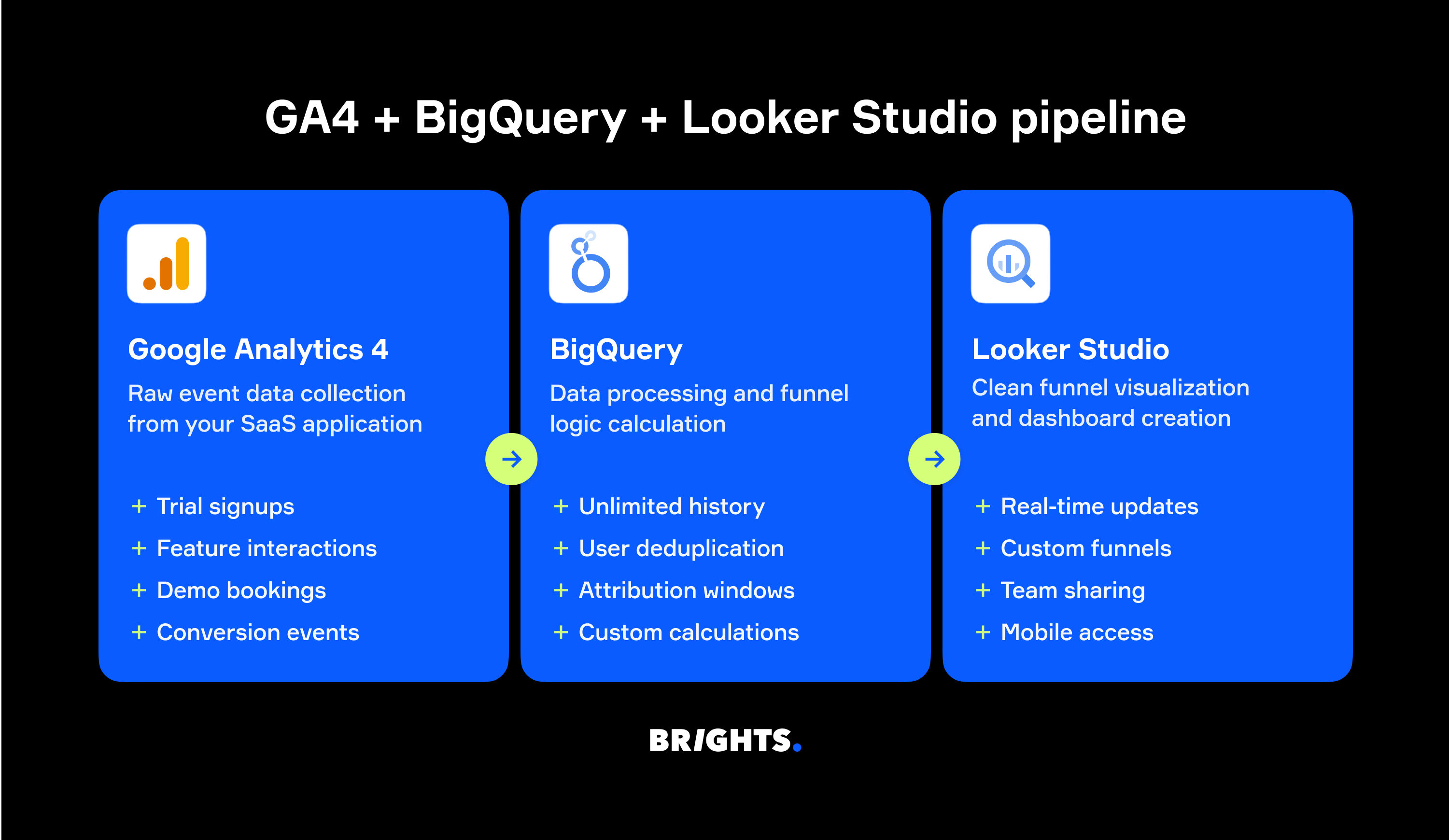
Vertical vs. horizontal layout considerations
A vertical Looker Studio funnel chart for SaaS works better for executive dashboards where you're showing conversion rates. Horizontal layouts excel in operational dashboards where teams need to see detailed stage-by-stage metrics and identify specific drop-off points quickly.
Advanced dashboard features for SaaS teams
Beyond basic charts, more sophisticated funnel dashboards include campaign-specific filters that let marketing teams isolate performance by traffic source, A/B test comparison views for measuring feature releases, and automated Slack alerts when conversion rates drop below defined thresholds.
How to create funnel charts in Looker Studio?
Building an effective and convenient funnel visualization requires methodical planning. Most failed attempts happen because teams jump straight into chart building without defining their business logic first. This Looker Studio funnel visualization tutorial focuses on getting the foundation right before touching any charts.
Step 1: Define your funnel stages
Start with your actual customer journey, not what you think it should be. Walk through your product like a new user would. Where do they first give you their email? When do they experience real value? Whether you want to track signup to paid conversion funnel in Looker or analyze other key journeys, this reveals stages like “Website visit → Trial signup → First login → Feature discovery → Paid conversion”. The magic number is 4–6 stages. Any more, and your team stops paying attention.
Step 2: Choose your data foundation
Your data source determines what's possible downstream:
GA4 direct connection works for basic funnels but limits you to 90 days of historical data.
BigQuery integration handles complex attribution and unlimited historical analysis for enterprise needs.
Google Sheets hybrid lets you blend GA4 behavioral data with CRM revenue data for complete attribution.
Step 3: Set up reliable event tracking
Use Google Tag Manager to create consistent event naming that survives website redesigns. Configure enhanced ecommerce events in GA4 for every micro-conversion that matters. Test religiously, since one misconfigured event can create phantom drop-offs that send you chasing optimization ghosts.
Step 4: Build and customize your funnel visualization
Install RedNavel or Databloo plugins for professional funnel charts, or use native bar charts for simpler needs. Layout strategy that works: conversion rates at the top, detailed metrics below, time filters where fingers naturally click.
Step 5: Avoid critical setup errors
Three funnel killers are missing intermediate stages that actually predict conversion, sloppy event mapping that creates data gaps, and inconsistent filters across charts that show conflicting numbers to stakeholders.
For more insights on adopting Looker Studio, check out our article with 10 tips for better reporting.
What funnel roadblocks will you hit in Looker Studio, and how to overcome them?
Even the most enthusiastic Looker Studio advocates admit it: the platform wasn't built with SaaS funnels in mind. Understanding these limitations upfront prevents weeks of frustration and helps you build workarounds that work.
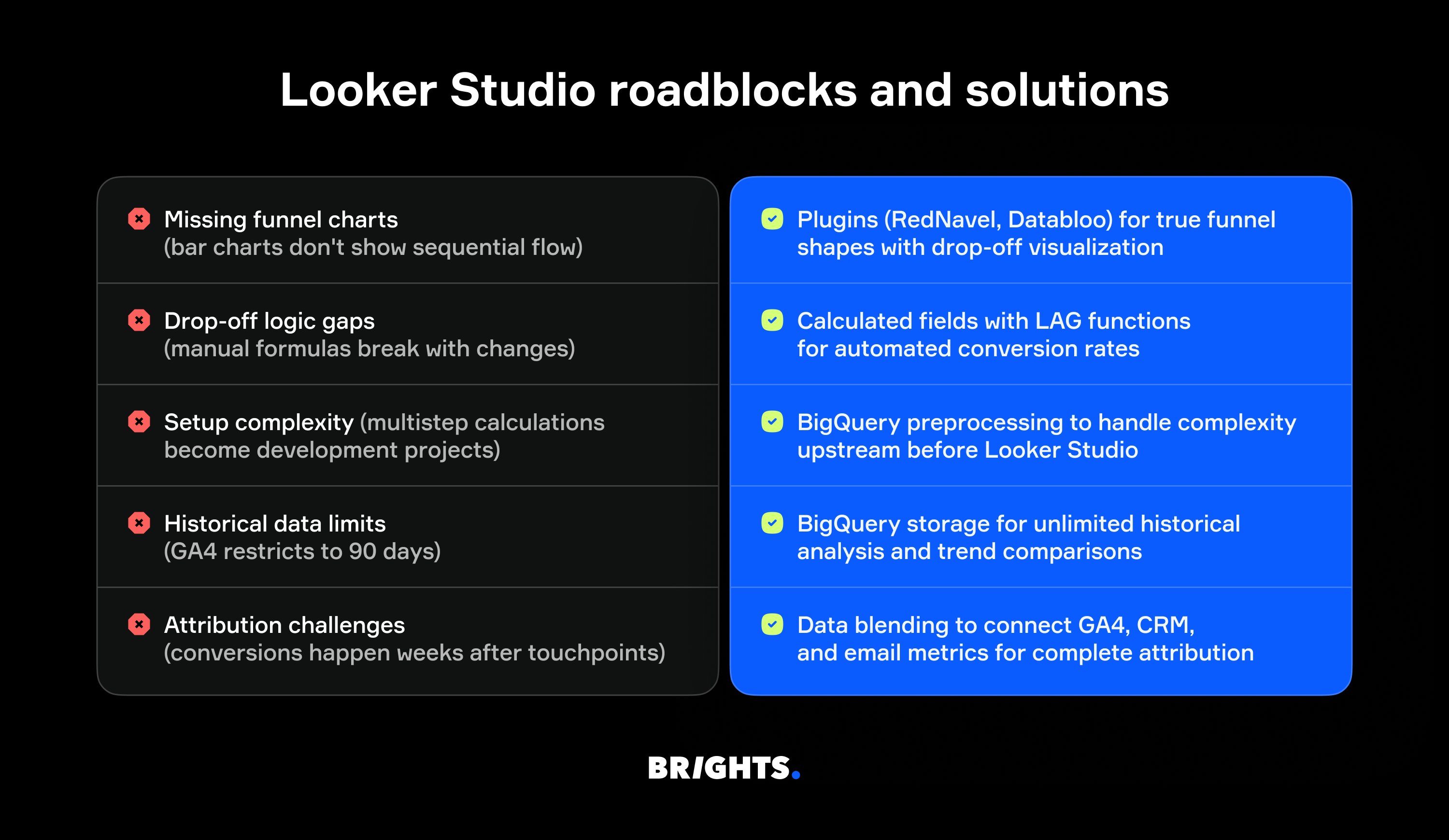
Missing funnel charts
Problem: With Looker Studio, you might get stuck with bar charts that show individual metrics but miss the sequential flow and visual drop-off patterns that make funnel analysis intuitive for stakeholders.
Workaround: Install RedNavel or Databloo plugins for true funnel visualization with customizable drop-off annotations, color coding for performance thresholds, and executive-ready presentation styling.
Drop-off logic gaps
Problem: Calculating conversion rates between stages requires manual formula building with complex CASE statements that break every time your event structure changes or new stages get added.
Workaround: Build calculated fields using LAG functions and conditional logic, such as (Current Stage Users / Previous Stage Users) * 100, to create automated conversion rates that update dynamically with fresh data.
Setup complexity
Problem: Multi-step funnel calculations demand calculated fields for every conversion rate, custom metrics for cohort analysis, and intricate filter logic that turns simple reporting into multi-week development projects.
Workaround: Connect GA4 to BigQuery first, then feed pre-calculated funnel metrics into Looker Studio to handle user deduplication, attribution windows, and complex segmentation before visualization.
Historical data limits
Problem: GA4 direct connections restrict you to 90 days of data, making it impossible to analyze seasonal trends, measure long-term optimization impact, or compare year-over-year performance for enterprise SaaS cycles.
Workaround: Use BigQuery's unlimited storage for historical analysis, enabling trend comparisons, seasonal analysis, and ROI measurement over quarters instead of weeks.
Attribution challenges
Problem: Standard connectors can't handle complex attribution models where trial signups happen in January but conversions occur in March, breaking revenue attribution for longer sales cycles.
Workaround: Implement data blending to connect GA4 behavioral data with CRM deal stages and email engagement metrics, creating complete customer journey attribution that matches your revenue reports.
At Brights, we've implemented these exact solutions for various SaaS companies, typically delivering production-ready funnel dashboards within 2–3 weeks that would take internal teams months to build and debug.
Your Looker Studio funnel visualization journey
“As believers in relying on data more than anything else, we love helping our clients embrace convenient data analytics and visualization tools. Our team has built dashboards, including funnel visuals, for SaaS companies across various industries: fintech, retail, medtech, and more. Each project taught us that technical skills alone aren't enough. You need someone who understands SaaS business models, knows why certain metrics matter more than others, and can spot the difference between correlation and causation in your conversion data.”
— Anastasiia L., project manager, Looker Studio expert at Brights
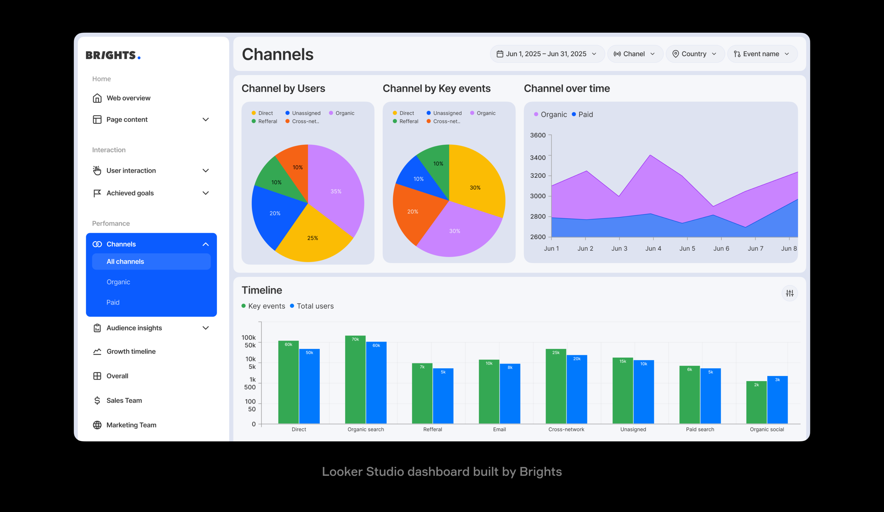
Looker Studio dashboard built by Brights
Here's what we bring to the table: deep GA4, BigQuery, and Looker Studio expertise combined with years of SaaS growth consulting. We know which funnels actually predict churn, how to handle multitouch attribution in longer sales cycles, and why your demo-to-paid conversion rate might be misleading you.
Looker Studio becomes a powerful tool when configured properly for SaaS workflows. It's cost-effective, scales with your team, and integrates seamlessly with your existing Google stack. But setup matters — get the data architecture wrong, and you'll spend more time debugging than optimizing.
Want to see what's possible with your current data? We can audit your existing setup and show you exactly where Looker Studio funnel visualization could solve your biggest visibility gaps.
FAQ.
Looker Studio doesn't have native funnel chart for SaaS options, but you can create horizontal funnel visualizations using plugins like RedNavel or Databloo. These third-party tools give you proper funnel shapes with drop-off visualization that standard bar charts can't provide. For basic needs, horizontal bar charts work as a simple alternative to visualize marketing funnel Looker Studio data.
