Smarter Looker Studio Dashboards: 10 Tips for Better Reporting

It might seem that a perfect dashboard is just a comprehensive one, with every metric imaginable, but in reality, there is much more to it. Looking back at our experience with setting up data analytics systems, we’ve gathered 10 critical Looker Studio dashboard tips that will help you leverage data to the fullest while also encouraging your team to adopt the new tool.
The difference between a dashboard that is used and one that is ignored usually comes down to thoughtful design and strategic implementation. By the end of this article, you’ll have a clear idea of how to transform complex data into easy-to-read actionable insights. After all, the ultimate purpose of Looker Studio is to drive smarter business decisions — and that’s what we’re here to help you with.
Our credentials? Implementation of data analytics tools for teams of various sizes and industries. A terminal network management and analytics system for banks and retail, a business scenario planning web app, and a medtech system for tracking selling pipelines — we’ve done it all.
“Working with clients who want to adopt Looker Studio for reporting automation, we always start with understanding how their business operates, what data they work with, and how they use it. I’d say there isn’t a request we can’t dive into. Even if the initial audit shows there are data gaps or other challenges, we provide recommendations on what our clients need to set up and which direction to take their analytics strategy.”
— Anastasiia L., project manager, Looker Studio expert at Brights
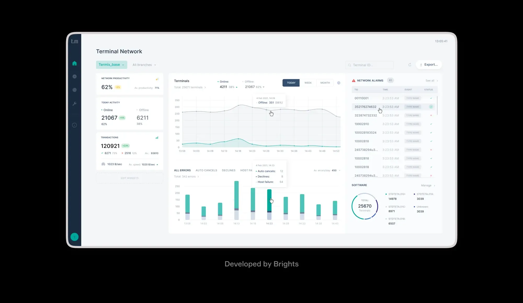
Data analytics dashboard in Termix, POS management system developed by Brights
Key takeaways
Looker Studio dashboards heavily rely on having a clean data foundation, which requires consistent naming conventions, proper formatting, and structured tables. Without these, the dashboards become unreliable for decision-making.
Limiting the number of widgets to 6-8 per screen ensures users are not overwhelmed. Additional metrics are better suited for separate pages or can be accessed through drill-downs.
Users naturally navigate through dashboards as if reading a newspaper; hence, placing key metrics in the top-left corner and arranging others logically helps achieve seamless navigation.
Dividing complex charts into smaller, focused groups not only looks tidier but also noticeably improves dashboard loading speed.
Saving templates with consistent colors, fonts, and chart styles helps speed up future reports and maintain a cohesive feel to all dashboards, which makes the adoption easier for users.
Looker Studio dashboards do not need to be perfect on the first try. Just like any other product, they require an iterative and test-driven approach, utilizing data and feedback to enhance them.
Tip 1. Start with your data foundation
As with any kind of development project, preparation is key, and in the case of Looker Studio, it all comes down to getting your data sources right. Here is what it entails.
Clean at the source level. Remove duplicates, standardize naming conventions, and create calculated fields in your database rather than in Looker Studio.
Optimize your connections strategically. Set up proper date formatting and ensure your primary keys are consistent across tables. Use data blending features sparingly since each blend adds processing time.
Structure your data tables properly. Design fact and dimension tables with clear relationships. Avoid wide tables with hundreds of columns that slow down queries.
Set up proper data types and formats. Ensure dates are recognized as dates, numbers as numbers, and text fields are properly categorized to avoid conversion issues in Looker Studio.
Create a consistent naming convention. Use business vocabulary so that non-technical users easily understand field names.
Completing these preparations will give you a reliable base that ensures scalability as your dashboards and data grow, saving you time in the future by reducing the need for troubleshooting performance issues.
Tip 2. Build for different roles
Most often, teams use Looker Studio dashboards for varying purposes across different roles. While each case is much more nuanced, a rough categorization here is dashboards for executives and analysts. Let’s get into the differences in how these two groups interact with Looker Studio reports.
| Aspect | Executives | Analysts |
|---|---|---|
| Data level | High-level KPIs and summaries | Granular, detailed data |
| Timeframe | Monthly or quarterly trends | Daily and weekly breakdowns |
| Alerts & exceptions | Exception alerts and outliers | Statistical comparisons and variance analysis |
| Device usage | Mobile-friendly layouts | Desktop-optimized with full functionality |
| Key visuals | Summary scorecards and dashboards | Drill-down charts and pivot tables |
| Benchmarking | Executive-level industry benchmarks | Detailed performance comparisons |
| Interaction | Quick glance, minimal clicks | Deep exploration and filtering |
| Data access | Curated, pre-filtered views | Raw data access and export capabilities |
| Update frequency | Real-time snapshots sufficient | Frequent refresh needed |
Using the filter controls in Looker Studio would yield better results than trying to fit everything into a single view. For this, you can set up role-specific default filters, which will dynamically populate designated pages within the same report.
Moreover, using conditional formatting to highlight what matters to each role further optimizes the interface. This method reduces information overload, allowing each user to derive value from the provided dashboards.
While the abovementioned features are built into Looker Studio, implementing them effectively may require custom development work to integrate with your data sources and business logic.
Tip 3. Establish clear ownership
This one’s easy to overlook, but without a designated dashboard owner, you risk facing dashboard chaos at some point. This person (or team, depending on the scale of your operations) needs to understand both the business context and technical requirements.
As the gatekeepers for changes, they will approve modifications, monitor performance, fix issues, address feedback, manage user access, and maintain data integrity.

On top of assigning this responsibility, it’s also crucial to create a simple change management process together. Yes, the stakeholders can suggest modifications, but it’s the owner who evaluates the impact on performance and user experience before implementation.
Hence, be sure to use Looker Studio's sharing settings strategically: give edit access only to owners and key collaboration stakeholders. We've seen cases where overly broad edit permissions led to accidental deletion of key charts and broken filters that messed up reporting data.
Last but not least, we recommend documenting everything important. This covers the dashboard's purpose, key metrics definitions, and update schedule in a shared location.
Tip 4. Master the art of layout
The rule of thumb with dashboards is that they should read like a newspaper front page, meaning you instantly see where to look first, second, and third.
To achieve this effect, use the grid system. Looker Studio's grid helps you create logical sections that guide the eye naturally. Place your most critical KPIs in the top-left corner where users look first, then arrange supporting metrics in a logical flow. Related metrics are better grouped together.
Another useful tip for your Looker dashboard layout strategy is the 6-8 widget formula. More than eight widgets per screen creates cognitive overload, so if you need more metrics, create multiple pages or use drill-down functionality. Basically, each screen should answer one specific business question.
“When you have too much data, charts will load very slowly, so I'd recommend breaking them into smaller functional groups. In addition to improving the grid layout, it optimizes dashboard load speed, as smaller functional groups of charts load much faster than data-heavy comprehensive views. For chart performance, be sure also to optimize queries and add caching where possible.”
— Anastasiia L., project manager, Looker Studio expert at Brights
Tip 5. Create visual consistency
One of the easiest ways you can encourage your team to use the new reporting tool is to make sure they aren't overwhelmed. Consistent Google Looker Studio design is part of the solution here. When all your corporate dashboards are designed and structured similarly, it allows users to quickly navigate through the reports.

Looker Studio dashboards implemented by Brights
“To achieve consistent visuals, our UI/UX designers recommend creating cohesive visual themes by standardizing whatever you can: primary colors, fonts, chart types for different data scenarios, time ranges, and so on.”
— Anastasiia L., project manager, Looker Studio expert at Brights
Building reusable templates can help maintain this consistency and save time. These are pre-designed dashboard layouts with your company's colors, fonts, and chart styles that serve as starting points for new reports. Yes, it takes an effort at first, but your team will thank you when they just have to copy and customize a bit to launch new reports, rather than starting from scratch. Our team can help create these template libraries during the initial setup, so that every future dashboard maintains the same look and feel.
Tip 6. Prioritize ruthlessly
Cramming the dashboards with all metrics imaginable is one of the most common mistakes we witness when working with Looker Studio dashboards. You can’t (and frankly, don’t need to) show everything at once.
Skilled curators focus only on what actually impacts the business. So, start with sifting through the metrics and questioning their relevance for decision-making. If revenue is down 15%, that matters. If page views increased by 200 but didn't impact conversions, these are vanity metrics that don't influence actions.
Tip 7. Design user journeys, not just charts
A good indicator of an effectively designed dashboard is when users flow naturally from one discovery to the next. For this, you need to create a clear hierarchy of importance, supporting logical information flows that mirror how people think.
Start with a KPI summary of overall performance, then move to trend charts that display patterns over time, and conclude with drill-down options by region, channel, or product category. For the sales team, the dashboard might begin with total revenue, then display monthly trends, and then provide details on what is driving growth.
One of the most useful Looker Studio UX tips to keep navigation user-friendly and intuitive is to use filters and toggles instead of creating dozens of separate pages. Link related charts so clicking on a data point automatically filters others, letting users explore different views within the same context.
Tip 8. Use data storytelling techniques
Narration techniques are kind of a natural continuation of the previous tip. To be really effective, dashboards need to go beyond showing numbers and explain why these numbers matter and what actions they point to.

Just a few Looker dashboard design tips and data storytelling techniques that our team recommends include:
Visual narrative elements: arrows, progress bars, and conditional formatting (red / yellow / green) to show performance status; spark lines within summary cards and comparison bars.
Contextual information: annotations for data anomalies, benchmark comparisons against industry standards, and period-over-period variance indicators.
Dynamic storytelling: smart text that changes with performance, automated insights highlighting key findings, and executive summary sections that adapt to current data.
Explanatory elements: brief methodology notes for complex calculations, data freshness timestamps, clear metric definitions, and descriptive titles that highlight conclusions.
Action-oriented design: urgent metrics, cause-and-effect relationships between related metrics, and recommended next steps.
Tip 9. Provide training for your team
It’s easy to put all the responsibility for adopting new reporting standards and BI tools on your team. But understanding how to navigate filters, interpret visualizations, and simply make the best of Looker Studio takes time and effort.
To ease the transition, consider investing in training sessions for different user groups, or at least developing a comprehensive guide your team can turn to. Having dashboard owners, who will act as the knowledge holders, is also extremely helpful.
When working with Brights, you can actually delegate this task to us, since we often provide basic training for our clients’ teams during implementation.
Tip 10. Test and iterate based on real usage
“Analytical tools like dashboards can be treated as products that serve as helpful assistants for your team. They don't need to be perfect from day one. As soon as people start working with them, it becomes clear which direction to take for improvements. Some charts that seemed amazing initially might turn out to be ineffective for the team in practice. The important thing is getting real value from every chart you include.”
— Anastasiia L., project manager, Looker Studio expert at Brights
Tracking user behavior, implementing feedback sessions, and conducting A/B testing for different layouts — all of these will help you understand what's working and what isn't. Besides, you can use Looker Studio's built-in analytics to see which charts get the most attention, where users spend time, and where they drop off.
If you’re turning to Looker Studio, chances are, you value a data-driven approach. So, apply it when working on dashboard implementation as well.
For more insights on building effective Looker Studio dashboards, be sure to check out more of Brights’ expert guides.
Wrapping up
Well-designed Looker Studio dashboards tell a story using visuals and organized data — a story that empowers your team with the intelligence and insights they can act on. But building dashboards that a business can rely on takes time, technical expertise, and a commitment to uncovering how teams work with data.
Brights’ Looker Studio experts helped startups scale their analytics, supported SaaS teams in tracking complex user journeys, and built enterprise reporting systems that bring clarity to massive datasets.
So, if you need a team to support your transition to a data-driven approach, our Looker Studio dashboard development pros are ready to take on the task.
FAQ.
First of all, focus on data source optimization: prioritize extracts over live connections for large datasets that don’t require real-time updates, and avoid unnecessary calculated fields that perform complex operations. Additionally, consider breaking larger reports into smaller, focused dashboards alongside implementing smart caching by pre-scheduling data refreshes during non-peak hours.

